
A focused landing page belongs in your arsenal, whether your course is a free lead magnet that warms people up to your brand or the main product you sell.
The landing page is important because it gives visitors one clear path to take and helps turn casual interest into real signups. Good pages do this every day.
Across industries, the typical landing page converts around six to seven percent of visitors, which is a solid baseline when you are selling a course or collecting emails.
If you want an extra reason to care, here’s one: teams that build more targeted pages see more leads.
HubSpot has long reported that sites with 10-15 landing pages generate about 55% more leads than sites with fewer pages. The effect is even stronger as you scale to dozens of pages aimed at different audiences and offers.
We will look at examples in a moment, but first, let’s lock down the basics.
What is a course landing page?
A course landing page is a single, conversion-focused page with one job: to get visitors to buy into your course. That buy-in might be a payment, a trial, or an email signup for a free mini course.
The page brings together the essentials, who the course is for, what students will learn, how it works, what it costs, and what to do next. It ends with a clear call to action, so there is no confusion for the reader.
Why do you need a landing page for your course?
Reason 1: People should not have to hop between your homepage, pricing page, and blog to figure out if your course fits them. A landing page gives them everything in one place, which makes the decision easier and faster.
Reason 2: A landing page is also a workhorse for lead generation. Websites and landing pages are a top channel for capturing leads, right behind email. That is a strong signal that a well-built page is worth the effort.
Reason 3: A landing page is a focused sales pitch you can control. You decide the narrative, the proof, and the next step. You can test headlines, images, and signup forms without touching the rest of your site. Over time, a small set of changes can improve conversion by meaningful points. Hitting even a 10% conversion rate is often used as a mark of a high-performing page, and many course creators get there with clear messaging, good social proof, and tight forms.
What does a strong course landing page include?
These are some of the elements shared by almost all good landing pages. You can also use this list as a quick checklist.
- A headline that promises a clear outcome
- A short intro that says who the course is for and why it exists
- Bulleted outcomes so readers can scan and decide fast
- A simple curriculum overview or module list
- Social proof, testimonials, student results, logos if relevant
- Pricing and what is included, plus a risk reducer, like a refund window
- One primary call to action
- An optional secondary CTA for those not ready
- Clean copy at an easy reading level, and
- Media that helps explain (a quick video walkthrough works well)
As you go through our picks below, you’ll find a mix of these elements in all our picks below.
A look at 10 awesome course landing pages
There are thousands of course landing pages that we like, but for the sake of clarity and conciseness, we have limited ourselves to 10 landing pages. Spoiler alert: All of them are great at one thing or the other!
Example #1: Building a Second Brain
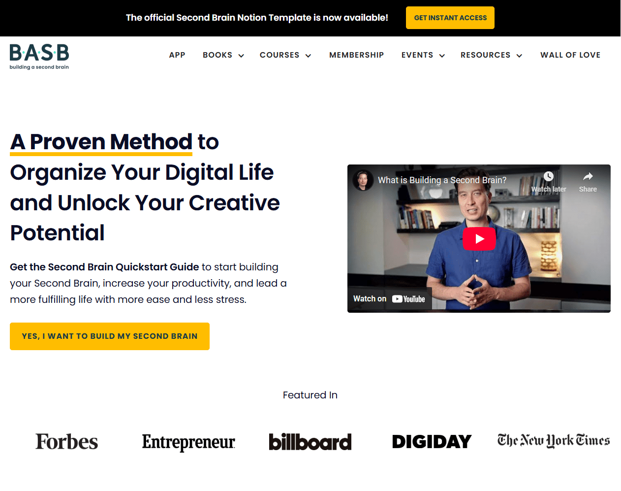
Creator: Tiago Forte
Course Topic: Personal knowledge management and digital organization.
A quick analysis of this page
- Crystal-clear headline and promise. A Proven Method to Organize Your Digital Life and Unlock Your Creative Potential tells you the outcome in one breath, then backs it up with a quickstart CTA above the fold.
- Actionable above-the-fold CTA. The hero invites visitors to “Yes, I want to build my Second Brain.” This is a specific, benefit-framed button that pushes intent, instead of a generic “Sign up.”
- Heavy social proof near the top. “Featured In” logos and a “Wall of Love” section link reduce risk and prove results, which is key for a premium education product.
- Authority-building bio. A very human-sounding “Hi, I’m Tiago Forte” section cements credibility with years of research and thousands of students, right on the main page.
Key Takeaway
Lead with a direct outcome in your headline, then add proof and a specific CTA immediately.
Example #2: JavaScript30 by Wes Bos
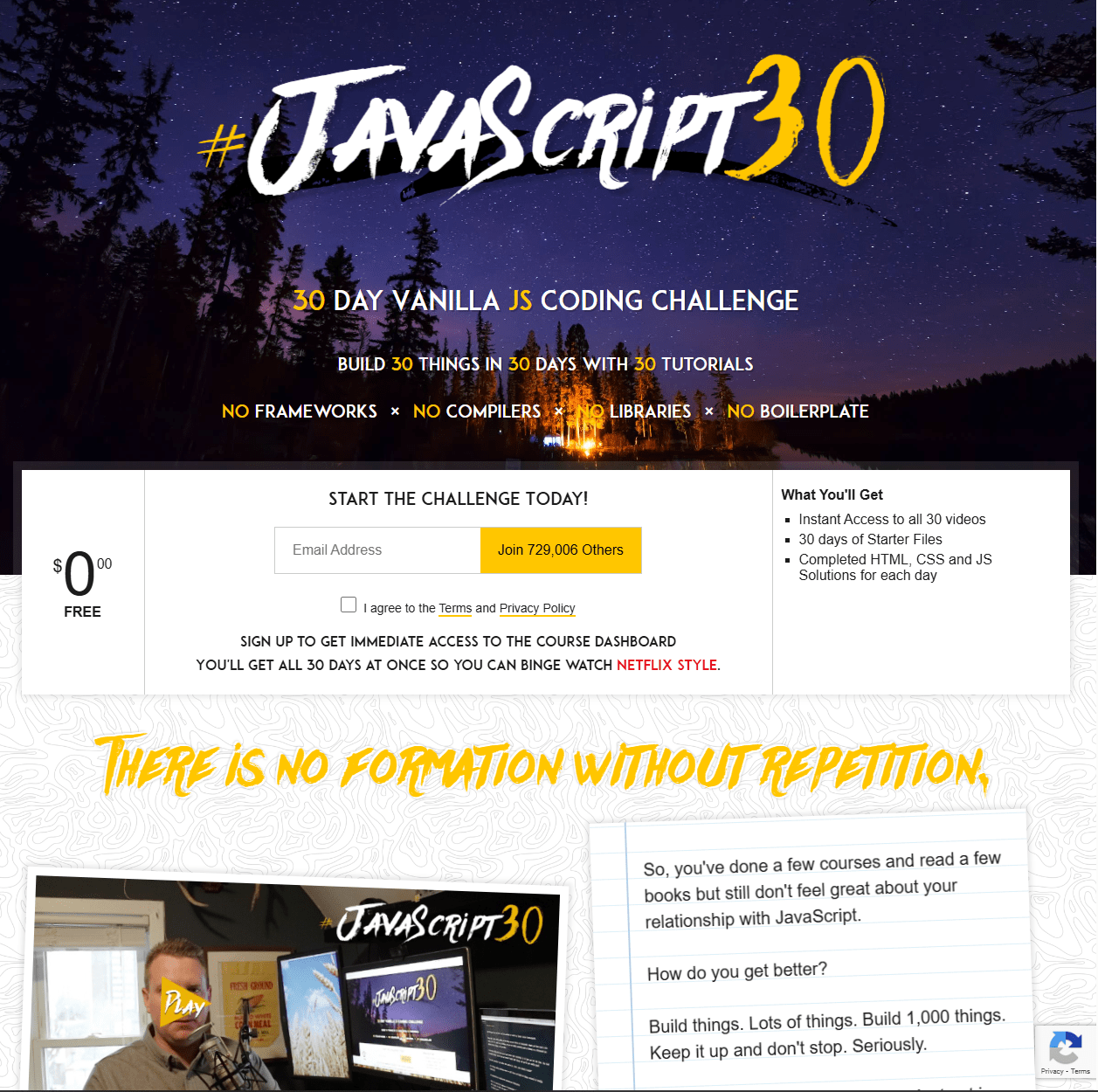
Course Topic: Vanilla JavaScript projects in 30 days
A quick analysis of this page
- Outcome-first headline. “30 Day Vanilla JS Coding Challenge” plus the subhead “Build 30 things in 30 days with 30 tutorials” makes the value concrete and time-bound
- Compelling CTA and zero-friction offer. Start The Challenge Today!” appears right under the hero, with “FREE” clearly displayed. This takes care of price anxiety and encourages immediate action.
- Credibility via scale. The FAQ references 700k+ participants to signal community and staying power for newcomers on the fence.
- Instructor trust. A short “Meet Wes Bos” section shows prior courses and teaching history. This increases confidence without drowning the page in biography.
Key Takeaway
Pair a specific, time-boxed promise with a frictionless CTA to convert curious visitors into active learners
Example #3: Ship 30 for 30
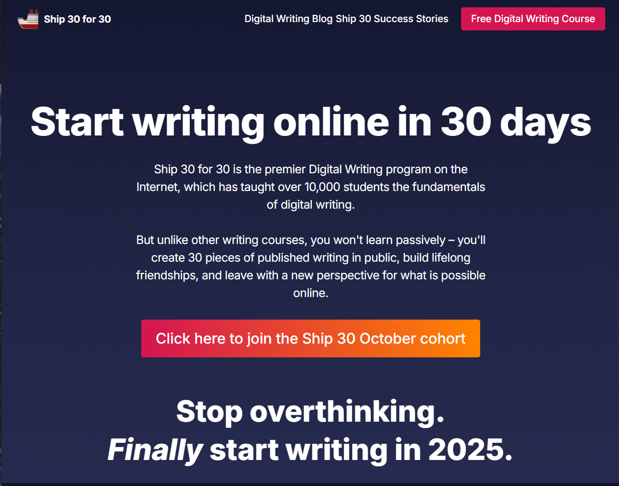
Creator: Dickie Bush and Nicolas Cole
Course Topic: Publishing a daily “atomic essay” and building a writing habit.
A quick analysis of this page
- Direct pain-to-outcome copy. The page reframes common writing struggles and offers a simple path, “30 Atomic Essays in 30 days,” which helps visitors visualize progress.
- CTA that matches intent. Multiple “Click here to join Ship 30” prompts appear in context as you scroll to reduce the distance between interest and action.
- Visible social proof. “Over 10,000 writers have built a daily writing habit” reinforces credibility for a behavior-change product, where proof of outcomes matters.
- Program clarity. The page details curriculum, live sessions, tools, and a refund policy to lower the perceived risk for a cohort program.
Key Takeaway:
Show the habit you build, the cadence you’ll follow, and proof that others have done it, then place the join CTA where momentum peaks.
Example #4: Write of Passage
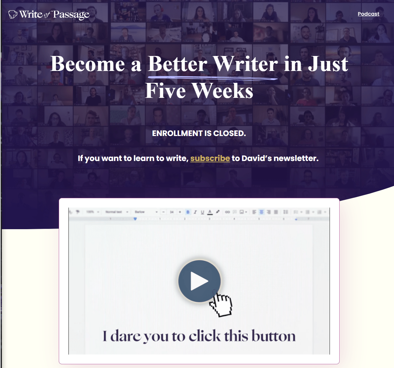
Creator: David Perell
Course Topic: Writing online with feedback and community
A quick analysis of this page
- Tight headline with time frame. The headline “Become a Better Writer in Just Five Weeks” sets a clear expectation and hints at pace and intensity.
- Smart use of state-based CTA. When enrollment is closed, the page pivots to “subscribe to David’s newsletter,” so traffic still converts into leads instead of bouncing.
- Community social proof. “Join 300+ writers” and a named testimonial from a known creator show real-world outcomes and the value of cohort energy.
- Implied instructor authority. The brand centers on Perell’s voice and community ethos, so visitors connect the curriculum to a recognizable teacher.
Key Takeaway
When enrollment closes, swap to a relevant lead CTA and keep the headline focused on a tangible result.
Example #5: Marie Forleo’s B-School
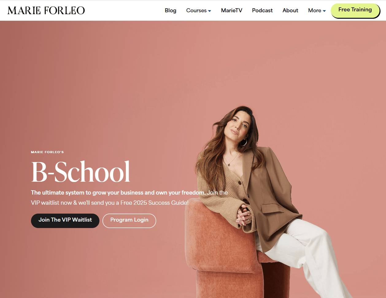
Creator: Marie Forleo
Course Topic: Building and growing an online business
A quick analysis of this page
- Bold visual credibility. The hero highlights the program environment and curriculum materials. That helps visitors picture the experience.
- Trust at scale. “80,000 entrepreneurs across 650+ industries and 171 countries and territories” give social validation for a high-ticket program, which helps justify the investment.
- Clear instructor authority. The page cites Marie as a NYT bestselling author and names major recognitions, which builds confidence in her expertise/
- Multiple proof paths. From “Read Verified Reviews” to program FAQs and module previews, the page meets shoppers at different readiness levels.
Key Takeaway
For premium courses, stack authority and social proof early, then offer clear paths to explore details or enroll.
Example #6: Part-Time YouTuber Academy
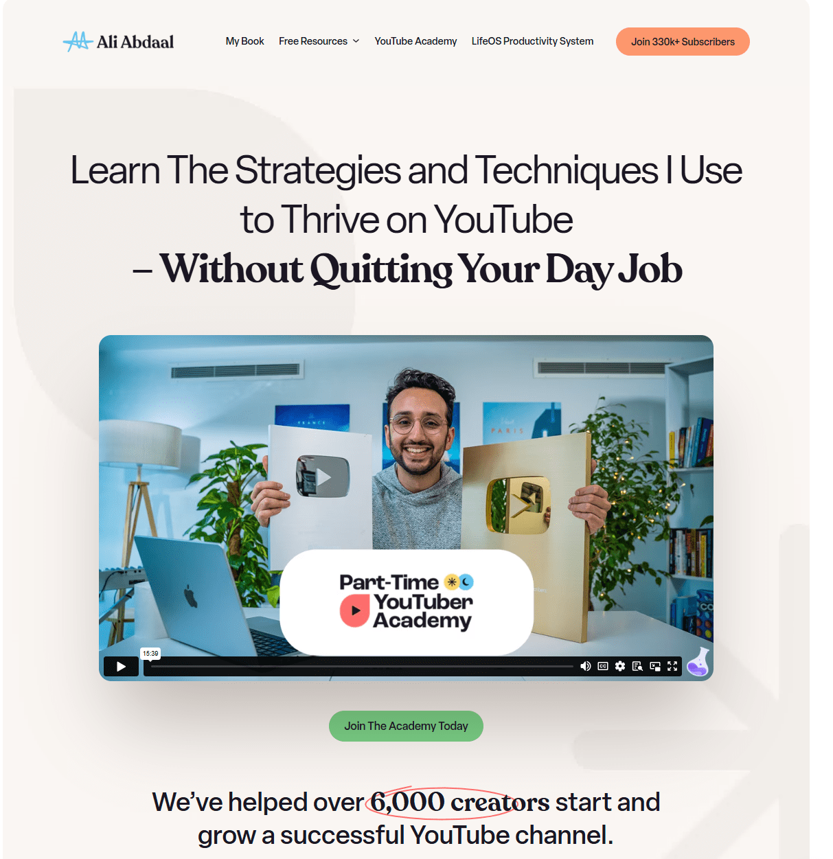
Creator: Ali Abdaal
Course Topic: Building and growing a YouTube channel part-time
A quick analysis of this page
- A clear positioning. The hero frames the offer as The Part-Time YouTuber Academy, 7 years of YouTube experience, one immersive, self-paced course. This positioning signals outcome and format in a single sweep.
- Compelling CTA. Buttons like “Join The Academy” appear near pricing and reappear as you scroll to keep action visible when motivation peaks.
- Excellent use of social proof. The testimonial section and named creators highlight results and reduce the perceived risk for a premium course.
- Strong instructor bio. A personal narrative shows milestones and channel scale, which anchors expertise with concrete numbers.
Key Takeaway:
Lead with a simple promise, keep CTAs in view, and let named testimonials do most of the work.
Example #7: YC Startup School
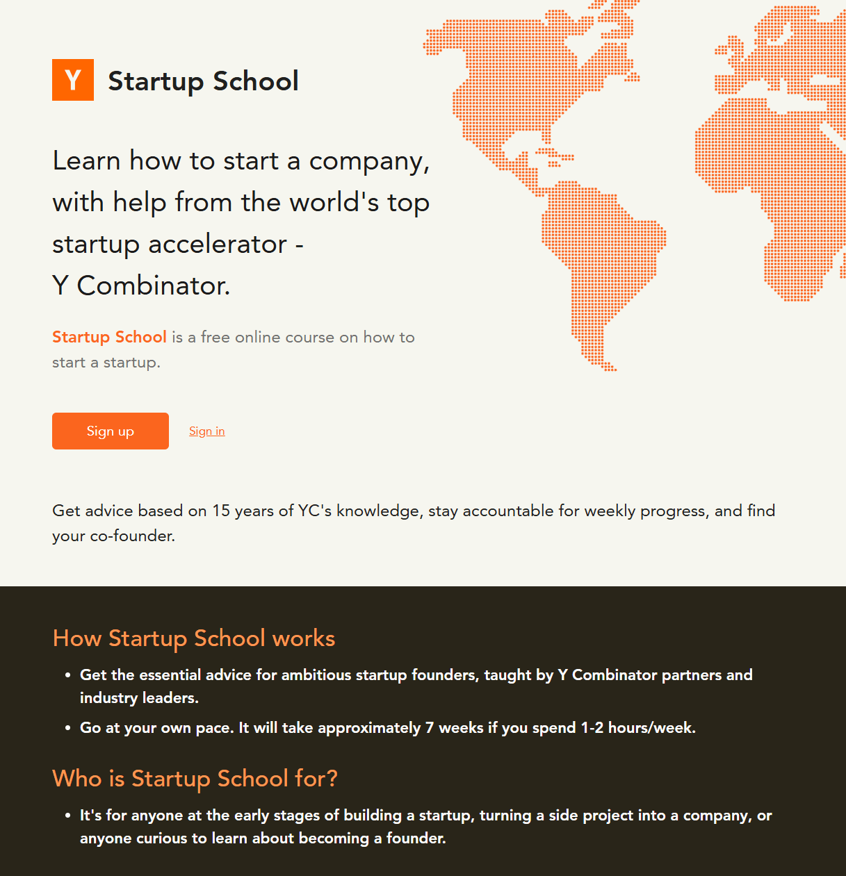
Creator: Y Combinator partners and guest instructors
Course Topic: How to start and grow a startup
A quick analysis of this page
- Precise and sharp headline. “Learn how to start a company, with help from the world’s top startup accelerator” is direct and benefit-led.
- Compelling CTA. The hero keeps “Sign up” and “Sign in” side by side, making the first step obvious and fast.
- Excellent use of social proof. It highlights co-founder matching with 100,000 plus matches and names well-known speakers to build trust and excitement.
- Strong instructor bio. The page lists YC partners and industry leaders as instructors. This is a good way of borrowing credibility from a respected brand.
Key Takeaway
State the value in one line, keep the primary CTA visible, and anchor the offer with recognizable experts and numbers.
Example #8: Gordon Ramsay Teaches Cooking I
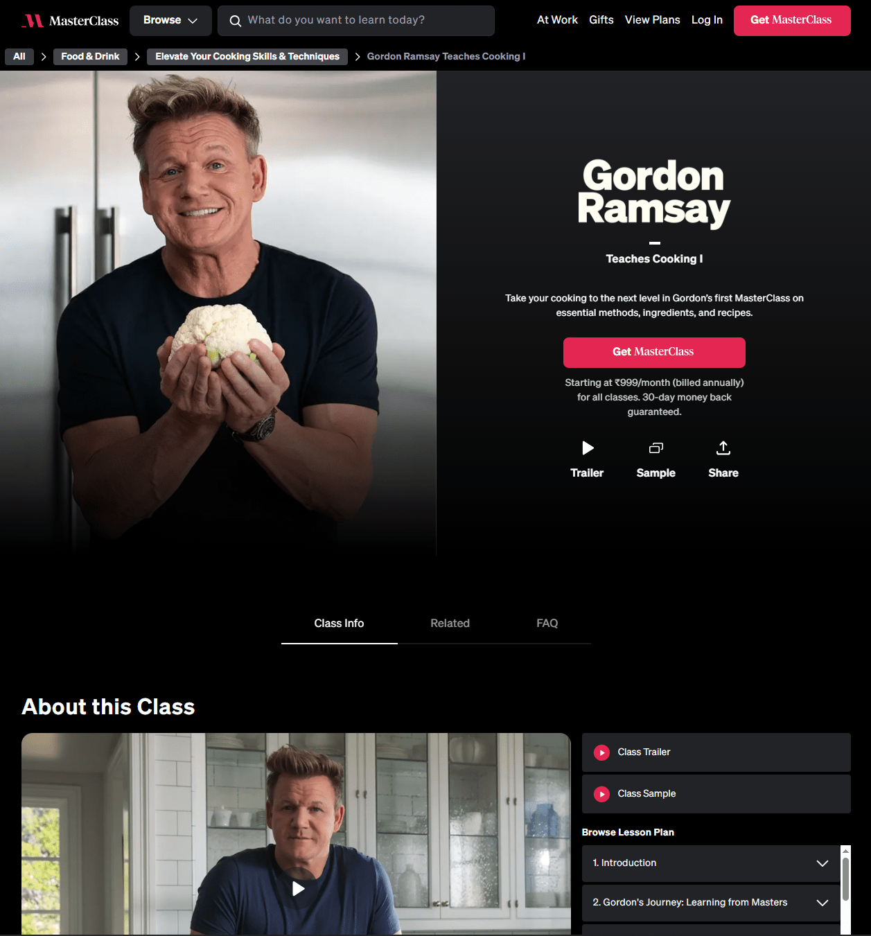
Creator: Gordon Ramsay on MasterClass
Course Topic: Essential cooking techniques and recipes
A quick analysis of this page
- Simple but effective headline. “Teaches Cooking I” with the line “Take your cooking to the next level” tells visitors exactly what they will get.
- Attractive CTA. A single “Get” button plus the price framing “Starting at $15 per month, billed annually” reduces decision friction for a subscription model.
- Excellent use of social proof. The 30-day money-back guarantee and “Included with MasterClass” copy provide platform-level trust even without student counts.
- Strong instructor bio. The brand name and image do most of the selling; the page centers Gordon’s authority visually, which is enough for this audience.
Key Takeaway
If the instructor is the biggest attraction, keep the headline simple, the CTA clean, and let reputation carry the proof.
Example #9: SuperHi
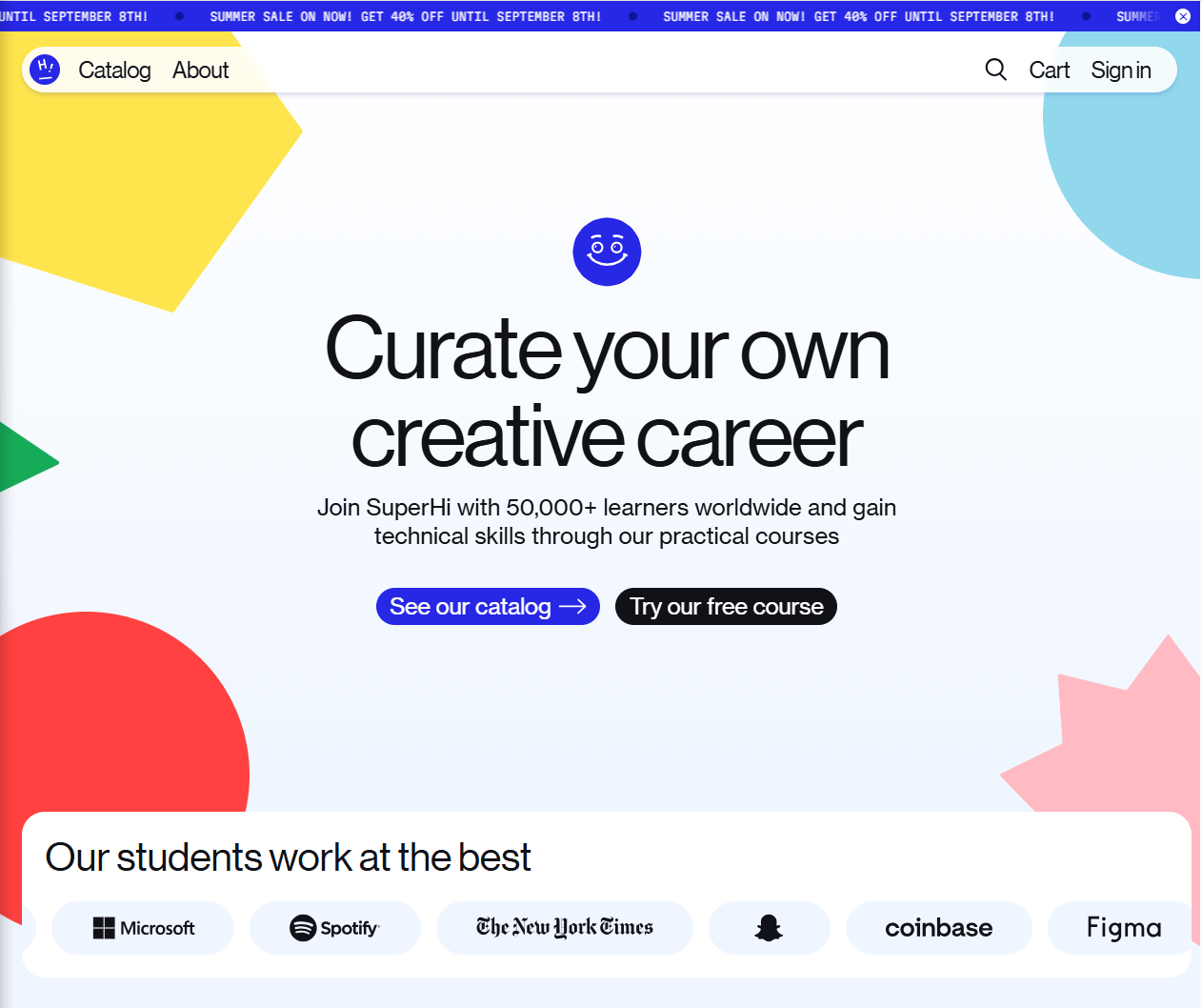
Creator: A collective of designers and developers
Course Topic: Web design, coding, and digital project management for creative people.
A quick analysis of this page
- Vibrant and unintimidating visuals: The first thing you notice is the playful and colorful design. It visually communicates that learning to code can be a fun and creative process. It breaks down the stereotype of coding being a purely logical and monochrome activity.
- Benefit-driven, jargon-free language. Headlines like "Learn the skills to bring your ideas to life" emphasize empowerment instead of forgettable technical specifications.
- A try-before-you-buy mentality. SuperHi provides a wealth of free resources, tutorials, and introductory materials. This approach provides genuine value upfront, building trust and goodwill, and it gives potential students a real taste of their teaching style.
- Flexible and modern learning structure. The page highlights that you can learn at your own pace and connect with a global network of fellow creatives. This is a huge selling point for busy professionals and freelancers who need to fit learning into their already packed schedules.
Key Takeaway
You can create a playful aesthetic with clear, benefit-focused language and a generous amount of free content to create a welcoming and inspiring environment that makes you excited to learn.
Example #10: Piano In 21 Days
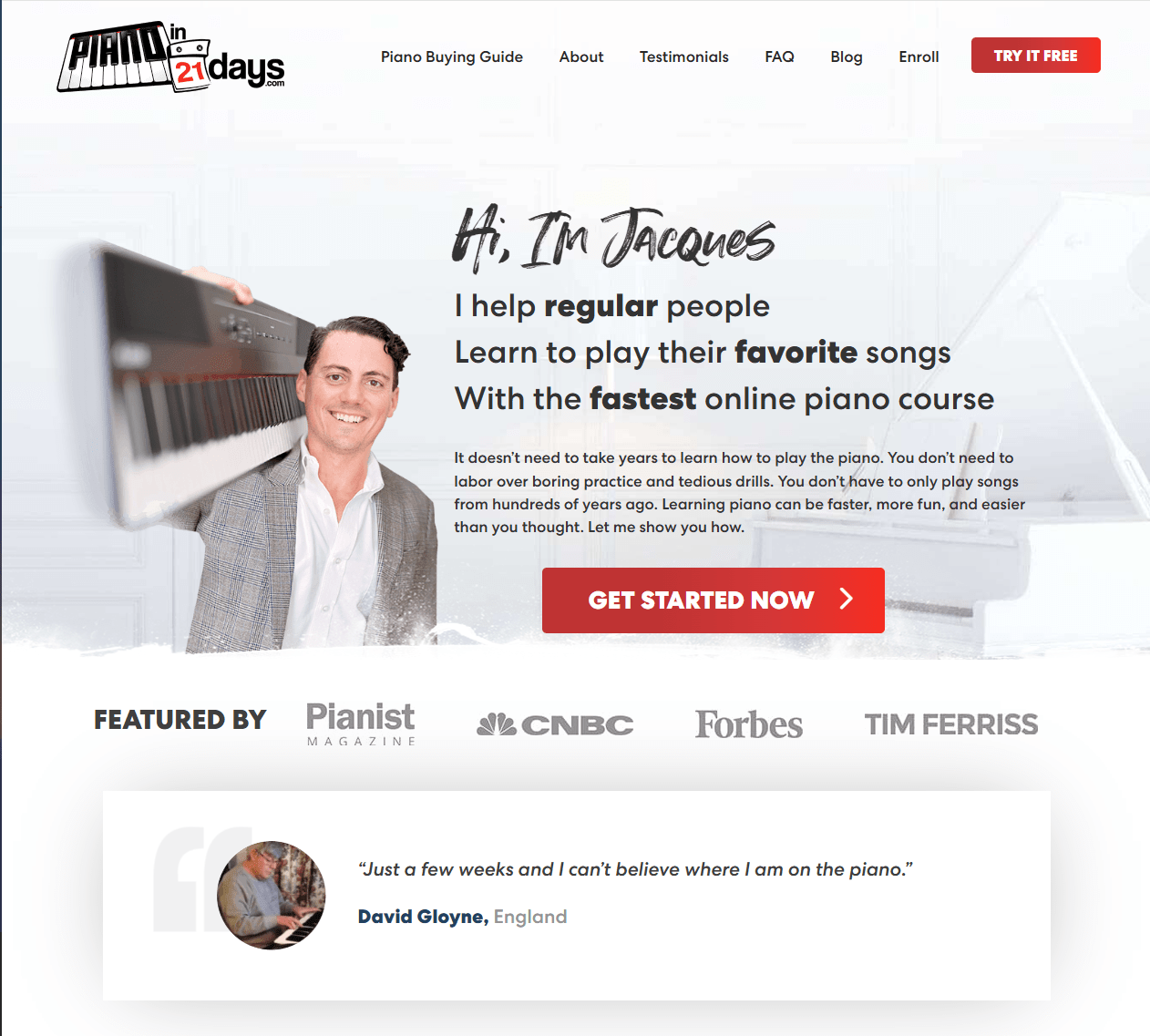
Creator: Jacques Hopkins
Course Topic: Learn modern songs on piano without heavy theory
A quick analysis of this page
No nonsense, straight-to-the-point copy. The hero spells out the benefit as sharply as a knife — I help regular people learn to play their favorite songs with the fastest online piano course. This instantly frames outcome, audience, and approach.
Intention and contextual CTA. “Get started now” sits above the fold and reappears as you scroll, so there is always a next step within reach.
Excellent use of social proof. “Featured by” media logos show up near the top, and deeper down the page, he adds “Join 95,000+ people,” which reduces risk and leverages herd momentum.
Strong instructor bio. Opening with “Hi, I’m Jacques” and a short origin story humanizes the brand and establishes authority without a wall of text.
Key Takeaway
The best way to lower friction is to lead with a human promise, keep the CTA visible, and add proof early.
Key Principles for a High-Converting Course Landing Page
A course landing page is where curiosity turns into commitment. It is the moment a reader decides to trust you with their time, their attention, and often their money.
It helps to think of your landing page as a conversation with a visitor who has one question in mind: Is this course right for me? When your page answers that question with clarity and care, conversion follows.
The principles below will help you do exactly that, and you will see how small, practical choices stack up into a page that feels trustworthy, easy to read, and ready for action.
1. Lead with a single, specific promise
Your headline sets the entire frame. A visitor should be able to read the first line and instantly understand what your course helps them achieve, who it is for, and why it matters now. Keep the promise narrow rather than broad, since specificity builds confidence. A subhead can add a time frame or format, so a reader can picture the path before they scroll.
Aim for plain language that sounds like something you would say out loud. Avoid jargon. Shorten long phrases into everyday words. If you teach a complex skill, let the headline carry the outcome while the next line defines the scope, for example, Become a job-ready data analyst, then, Learn the tools, projects, and interview skills employers expect.
We really love DesignLab’s landing page for this reason. Focus on the hero and the headline:

Here’s a quick checklist to tune your hero section.
- The headline names a clear result, and the audience
- The subhead adds timing or format, cohort, self-paced, or hybrid
- A single primary button sits near the headline
- The hero image or video reinforces the outcome
When in doubt, test alternate headlines with small tweaks in outcome or audience. Even subtle shifts can move signups because readers feel seen.
2. Make the path to action effortless
Great pages guide attention, then make action obvious. Decide on one primary call to action for the page and use it consistently.
Place the primary CTA above the fold and repeat it after every major section so the next step is always within reach.
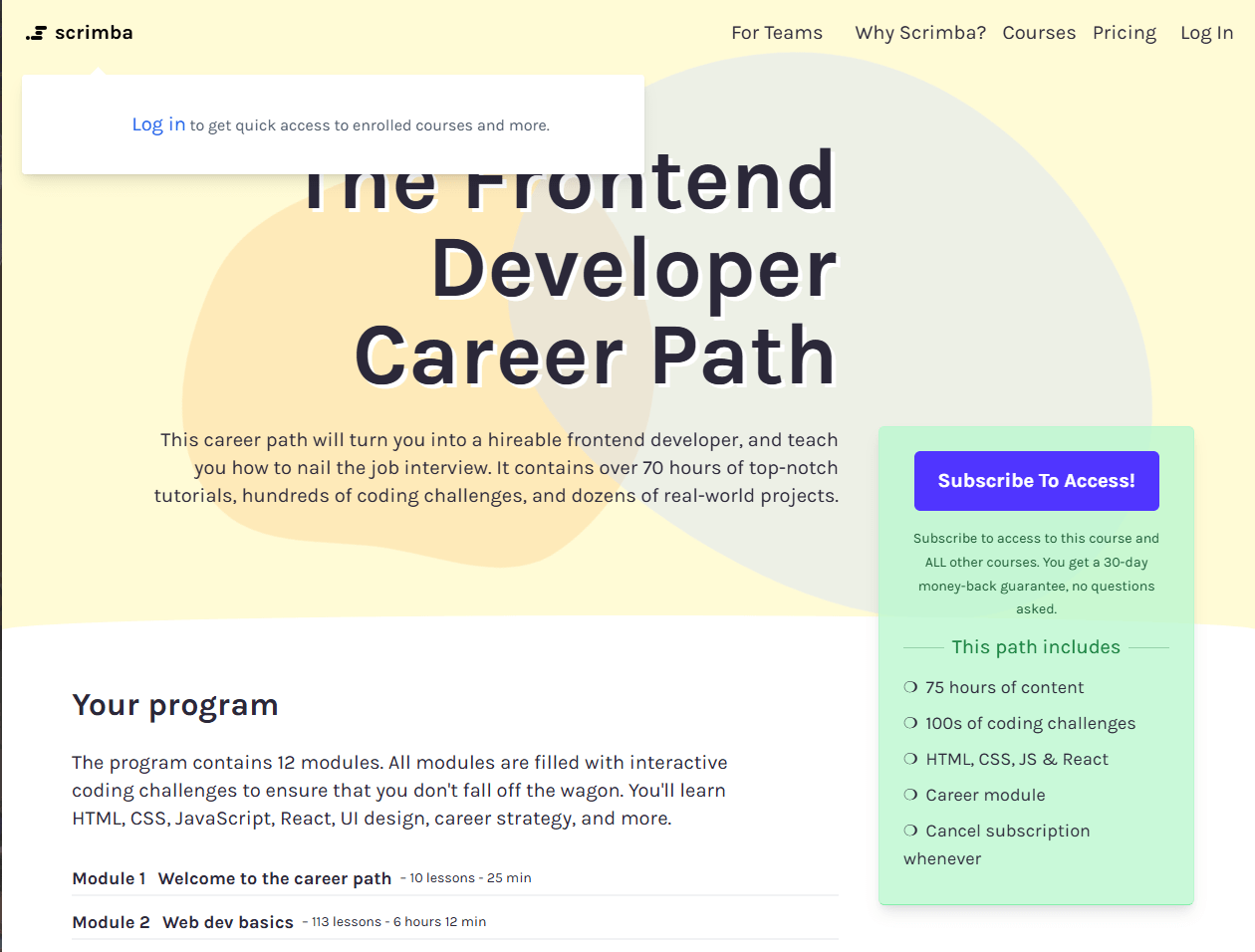
If your background is light, the button should feel comfortably bold. If the background is rich, the button should read clean and simple. Keep the label short and benefit-led, more clarity, less cleverness. Look at one of Scrimba’s course landing pages, and you’ll know what we are talking about. The hero area pushes a simple subscription action, with copy like “Subscribe to access.”
On mobile, a sticky footer bar with the CTA keeps momentum high for scanners who scroll fast. Reduce friction around the action as well. If the offer is free or risk-free, say so near the button. If there are payment plans or scholarships, surface them before the FAQ so affordability questions do not stall the decision.
3. Build trust with proof that feels human
People want to see evidence that looks like their own story. Social proof should be visible early and woven throughout the page.
We recommend mixing short testimonials with named faces, concise outcome snapshots, and recognizable logos if you have them. Screenshots of student projects work well when your course teaches a demonstrable skill. If you have data, explain it in plain words: number of graduates, completion rate, time to first result, and give that data context, how it was measured, and over what period.
Let’s revisit Designlab to see what strong social proof on a course landing page looks like:
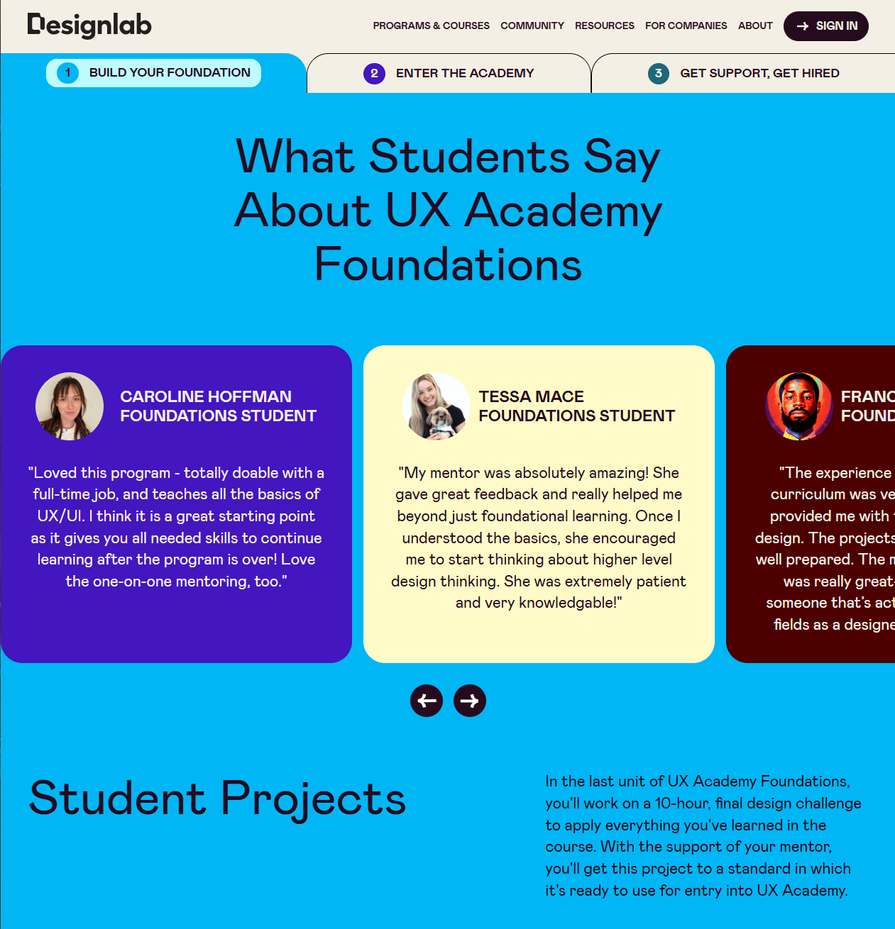
Here are some pointers for better social proof:
- Keep the proof specific; a testimonial that says “Loved it” is less persuasive than one that says “I shipped my first client project in three weeks after module two.”
- Place a handful of high-quality quotes near the hero and a deeper wall of proof farther down for the reader who needs more reassurance.
- Tie proof to claims. If you promise a career outcome, show actual outcomes, not just praise for your teaching style.
4. Structure the story so skimming through the page feels effortless
A high-converting page opens with the promise, supports it with proof, and then walks through what is inside, how it works, and what to do next.
Use generous spacing and short paragraphs so the eye never feels crowded. Break complex ideas into small chunks using subheads and bullets. This is not about dumbing things down; it is about respecting how people read on the web.
We’ve figured out a practical flow that works for most course pages
- Hero with promise, subhead, primary CTA
- Short intro outlining who the course is for and the key outcomes
- What you will learn is a bulleted outcome list, not only a module list
- Curriculum snapshot with a few key modules expanded for detail
- Instructor section with a focused bio that ties directly to the topic
- Social proof and results that match the promise above
- Pricing and what is included, with a simple value stack
- FAQ that neutralizes the top objections you hear most
Images and video should explain, not distract. A 60 to 90-second walkthrough of the learning experience often persuades more than a long paragraph. If the course is cohort-based, include dates and what the weekly cadence looks like. If it is self-paced, show time estimates and how support works.
5. Be transparent about pricing and reduce perceived risk
The hard fact is that clarity around money increases trust. List your price or plan options plainly and show exactly what is included at each level. If you offer payment plans, display the totals next to the monthly amounts to prevent confusion.
Explain refund terms in simple language and put them near the buy section so readers do not have to hunt. If you provide a free trial, outline what access it includes and when it converts, so there are no surprises.
For premium courses, a short value stack helps the reader tally the benefits, live sessions, 1:1 feedback, templates, community, lifetime updates, and how each piece supports the promise.
Use comparisons sparingly and fairly. A tiny table that contrasts your course with a generic alternative can highlight your strengths without dunking on competitors. If you teach in a crowded space, authenticity is more persuasive than bravado. When students see exactly what they get and what happens if the fit is not right, hesitation drops.
6. Keep improving through feedback, analytics, and small experiments
High-converting pages are never finished; they are maintained. And maintenance goes a long way.
Review your analytics weekly to learn where people drop off and what sections pull them back in. Scroll depth shows whether your hero and subheads are doing their job. Button click maps reveal whether your primary CTA is competing with a secondary one.
Time on page helps you diagnose whether the copy is engaging or confusing. Pair the numbers with qualitative feedback, short polls, and onboarding surveys, and note what new students say during their first week.
Run small experiments so you can keep what works and retire what does not. Swap a headline to tighten the promise. Test a different hero image that better depicts the outcome. Try a short video instead of a static screenshot. Move a key testimonial higher. Remove anything that feels like clutter. Keep your experiments humble so you can learn fast without risking the whole funnel.
FreshLearn Helps You Build Better Landing Pages
If you have been living under a rock, let us introduce you to FreshLearn.
FreshLearn is an all-in-one online course creation and sales platform designed for creators, coaches, and educators who want to transform their expertise into online courses, live workshops, cohorts, and digital products — all without needing coding or design skills.
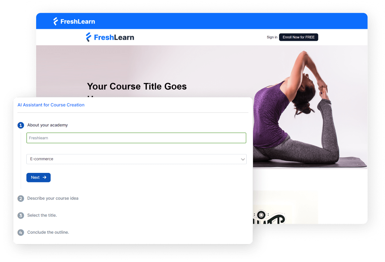
FreshLearn’s Sales Page Builder gives you a fast start with AI help and ready-made layouts, so you can effortlessly create a hero, outcomes, pricing, and FAQs, then fine-tune with simple drag and drop. You stay focused on your message while the builder handles the heavy lifting.
- Build faster with AI and templates. Generate section drafts in seconds, pick a clean template, and edit in a visual editor that keeps everything tidy as you tweak headlines, images, and CTAs.
- Keep the funnel smooth with a conversion-optimized checkout. Link your page to FreshLearn’s built-in checkout, offer one-time or recurring pricing, and connect to Stripe, PayPal, or Razorpay in a few clicks. No platform commission on payments adds confidence at purchase time.
- Add the finishing touches that lift conversion. Implement analytics, pixels, or live chat via custom scripts, so you can track behavior and offer timely help without hiring a developer.
And because the pages, checkout, and products live in one place, you avoid the usual tangle of plugins and fragile embeds.
If you want your landing page to look polished, load fast, and guide visitors straight to enrollment, FreshLearn gives you the pieces that matter and keeps the workflow simple.
Try FreshLearn today: Sign up for free.
FAQs
1. How much copy is too much on a landing page?
Enough to answer every likely question without making readers feel lost. Lead with a clear promise, then add scannable sections, outcomes, curriculum highlights, pricing, proof, and FAQs. If a section feels like fluff, cut it. If people still ask the same question in email, add that answer back to the page.
2. Do I need SEO for a course landing page?
Yes, even if most traffic comes from ads or social. Give the page a focused keyword, write a descriptive title tag and meta description, use one H1, and compress images. Add internal links from your blog or resources. It is a long game, but the compounding traffic is worth it.
3. What about page speed and performance?
Speed affects both conversion and SEO. Keep images under 250 KB where possible, lazy load below-the-fold media, and avoid heavy scripts you do not need. Run the page through a speed test tool, fix the biggest offenders, and recheck after every design change.
4. How do I make the page accessible?
Write in simple language, use proper heading order, and keep color contrast strong. Add alt text to images that carry meaning, and ensure buttons can be reached and activated with a keyboard. Captions on videos help more visitors than you think.
5. Should I use video on the page?
A short hero video or walkthrough can lift trust and time on the page. Keep it under ninety seconds, show the course environment, and speak to outcomes, not only features. Host it on a reliable player, add captions, and place a CTA near the video so viewers have somewhere to go.
You might also like
Hosted by