Landing Pages for Courses: What to Include and How to Build One That Converts

A course landing page has one job: turn a visitor who knows nothing about your course into someone willing to pay for it. That's a significant persuasion task, and most course landing pages fail at it — not because the course is bad, but because the page doesn't do the work.
This guide covers what actually belongs on a course landing page, in what order, and why — plus real examples from course creators who get it right.
What a Course Landing Page Is (and Isn't)
A course landing page is a standalone page with a single purpose: sell enrollment in your course. Unlike your homepage or blog, it has no navigation menu, no links to other pages, and no distractions. Every element on the page exists to answer one of three questions the visitor is asking:
- Is this for me? (Who is this course for and what problem does it solve?)
- Can I trust this? (Who is the instructor? What have other students experienced?)
- Is it worth it? (What will I get and what does it cost?)
If your page answers all three questions clearly and confidently, most people who are the right fit for your course will enroll. If it leaves any of them unanswered, they'll leave.
The Anatomy of a High-Converting Course Landing Page
1. The Hero Section
The first thing a visitor sees. It needs to communicate three things immediately: what the course is, who it's for, and what outcome it delivers.
What to include:
- A headline that leads with the outcome, not the topic. "Learn Photoshop" is a topic. "Go from beginner to confident photo editor in 30 days" is an outcome.
- A one-line subheadline that adds specificity — who the course is for, or what makes it different.
- A clear CTA button — "Enroll Now," "Start Today," or "Get Instant Access." Not "Submit."
- A course image, mockup, or short preview video (30–60 seconds maximum in the hero).
What to avoid: A hero section that lists features instead of outcomes, a headline that says the course name without explaining what it does for the student, or a background image that makes the text hard to read.
2. The Problem Statement
Before you sell your course, the visitor needs to feel understood. A brief problem statement — two to four sentences — that names the specific frustration or gap your course addresses does more persuasion work than any feature list.
Good example: "Most beginner photographers spend years shooting in auto mode because nobody teaches them the fundamentals in plain English. By the time they figure it out, they've missed thousands of shots they can't get back."
This section doesn't pitch the course. It just shows the visitor you understand their situation. When people feel understood, they keep reading.
3. What's Included (The Curriculum)
A clear, scannable breakdown of what the course covers — organized by module or week. This section serves two purposes: it helps the right people self-select in, and it helps the wrong people self-select out. Both are valuable.
Best practices:
- Show module names with brief (one-line) descriptions of what each covers.
- Include a lesson count or approximate time commitment per module.
- If your platform supports it, offer a free preview lesson directly from the landing page — students who watch a preview are significantly more likely to enroll. FreshLearn's sales page builder includes an expandable curriculum block with a video preview and free lesson access built in.
4. Who This Is For (and Who It Isn't)
One of the most underused sections on course landing pages. A short "This course is for you if..." list followed by "This course is NOT for you if..." does two things:
It increases conversion from the right audience by making them feel directly addressed. It reduces refund requests and negative reviews by filtering out the wrong audience before they buy.
Be specific. "This is for you if you're a freelance designer who wants to raise your rates without losing clients" is more persuasive than "This is for anyone who wants to improve their design skills."
5. Instructor Bio
Your credibility section. Visitors want to know: why should I learn this from you specifically?
What works:
- Lead with relevant experience, not credentials for their own sake. "I've helped 2,300 students pass their PMP exam" is more persuasive than "I have a Master's in Project Management."
- A photo — ideally one that looks like you're talking to someone, not a stiff headshot.
- Keep it to three to five sentences. The instructor bio is not a CV.
6. Student Testimonials and Results
Social proof is the highest-converting element on most course landing pages — but only if it's specific.
What works:
- Testimonials that describe a specific result or transformation: "Before this course I was charging $40/hour. Six months later I'm at $120/hour with a waitlist."
- Video testimonials when available. A 30-second video from a student carries more weight than three written reviews.
- Include the student's name, photo, and if relevant, their profession or context.
What doesn't work: Generic testimonials like "Great course, highly recommend!" They're not persuasive because they tell the visitor nothing about what the course actually does.
7. Pricing and What's Included
State your price clearly. Don't make visitors hunt for it — burying the price creates friction and erodes trust.
Effective pricing section elements:
- Price displayed clearly, with any payment plan options (3 payments of $X) shown alongside the full price.
- A bullet list of what's included — lifetime access, community, bonus resources, certificates, Q&A sessions.
- A brief value justification: what's the outcome worth vs. what they're paying? This doesn't need to be a hard sell — a single sentence works: "Compare this to a $3,000 in-person workshop covering the same material."
- A money-back guarantee if you offer one. Even a 14-day guarantee significantly reduces purchase hesitation.
8. Urgency and Scarcity (When Genuine)
Countdown timers and limited-enrollment messaging work — but only when they're real. A countdown timer that resets every time a visitor loads the page destroys trust faster than it builds urgency.
Genuine urgency mechanisms for course creators:
- An early-bird price that actually expires on a set date.
- Cohort-based enrollment with a genuine close date (enrollments close when the cohort starts).
- A limited number of spots for live Q&A access or group coaching.
FreshLearn's sales page builder includes countdown timers, scarcity badges, limited-spot indicators, and exit-intent popups. Use them for real deadlines, not manufactured ones.
9. FAQ Section
An FAQ at the bottom of your landing page is a conversion tool, not an afterthought. Think of it as handling your most common sales objections in advance.
Common FAQ topics that reduce purchase hesitation for courses:
- How long do I have access? (Lifetime access is a strong reassurance)
- What if I fall behind? (Can I work at my own pace?)
- What format is the content? (Video, text, live sessions?)
- Is there a community or support available?
- What's your refund policy?
- Is this right for someone at my level?
10. A Final CTA
End with a clear call to action that recaps the core promise and removes the last bit of friction. Something like:
"If you're ready to [specific outcome], [Course Name] gives you everything you need to get there. Enroll today and get instant access."
One button. One link. Nothing else.
What Makes a Course Landing Page Convert in 2026
Beyond the sections above, a few things separate landing pages that convert well from ones that don't:
Mobile-first design. More than half of your visitors are reading on their phones. A landing page that looks polished on desktop but requires pinching and zooming on mobile loses sales at every scroll.
Page load speed. Every additional second of load time reduces conversion rates meaningfully. Keep videos hosted on your platform (not embedded from YouTube, which adds load overhead), compress images, and avoid heavy scripts.
Scroll depth analytics. Most landing page visitors don't read every word — they scan and drop off at a certain point. Knowing where visitors stop scrolling tells you exactly which section is losing them. FreshLearn's sales page analytics include scroll depth heatmaps alongside conversion rates and revenue attribution, so you can identify and fix the specific section that's costing you enrollments.
AI-assisted copy. Most course creators spend more time on page copy than on page structure. AI tools can generate headline options, testimonial prompts, and FAQ answers quickly — useful for breaking through writer's block. FreshLearn's AI Studio can generate sales page copy grounded in your course content rather than generic marketing language, which makes for copy that's actually accurate to what you're selling.
5 Real Course Landing Pages to Learn From
These are real FreshLearn creators whose landing pages do specific things well. Each one is worth studying for a different reason.
1. Poschology Coaching
Rachel Lounds is an imposter syndrome specialist who helps professional women in media and corporate environments tackle self-doubt and reach for bigger opportunities.
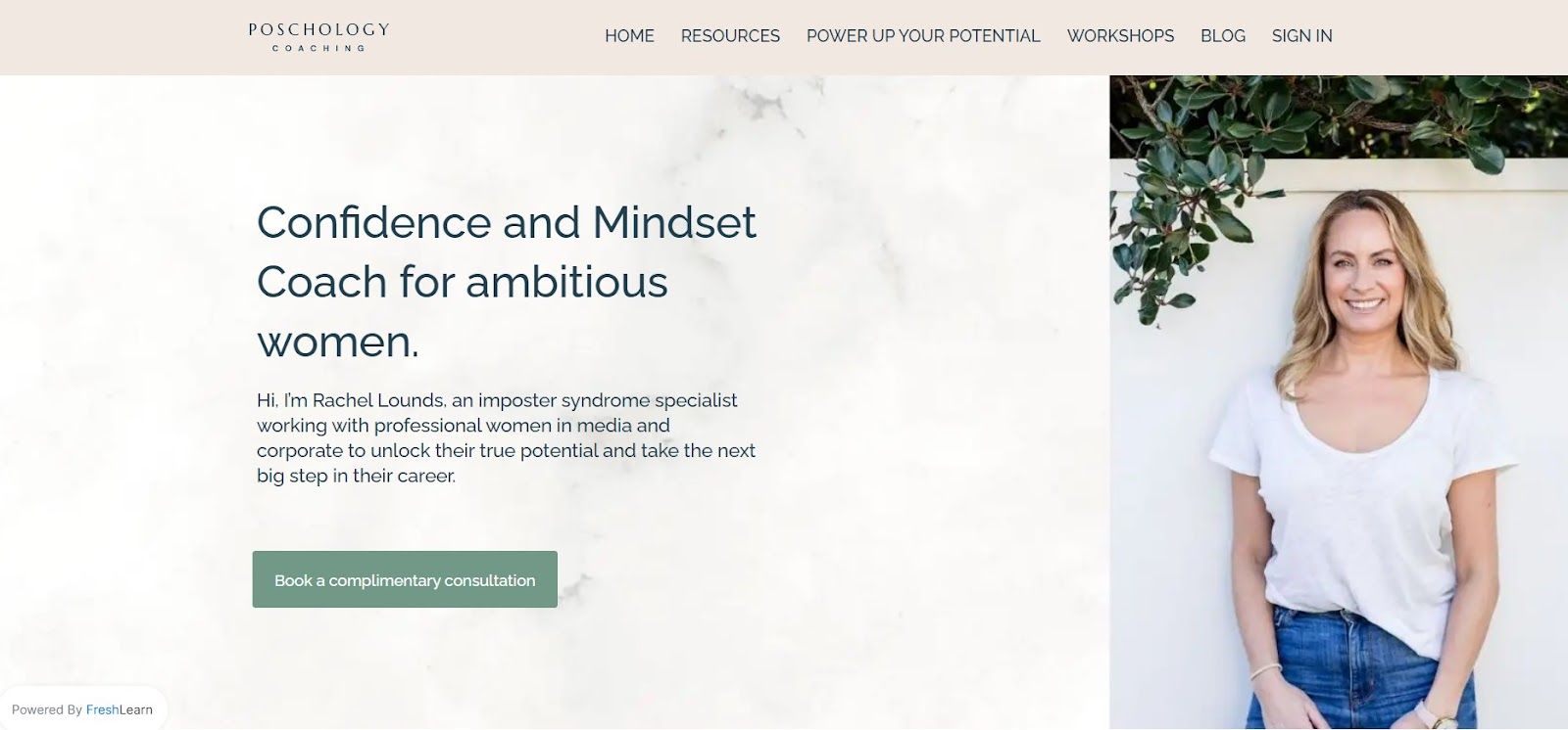
What this page does well: The problem statement is unusually specific. Rather than positioning broadly as a "confidence coach," Rachel names the exact audience (professional women in media and corporate) and the exact obstacle (imposter syndrome). This specificity filters in the right audience and instantly creates the "this is for me" feeling that drives enrollment.
2. Sophie Benge
Sophie Benge helps midlife women rediscover feminine power and pleasure through courses, workshops, retreats, and conversations.
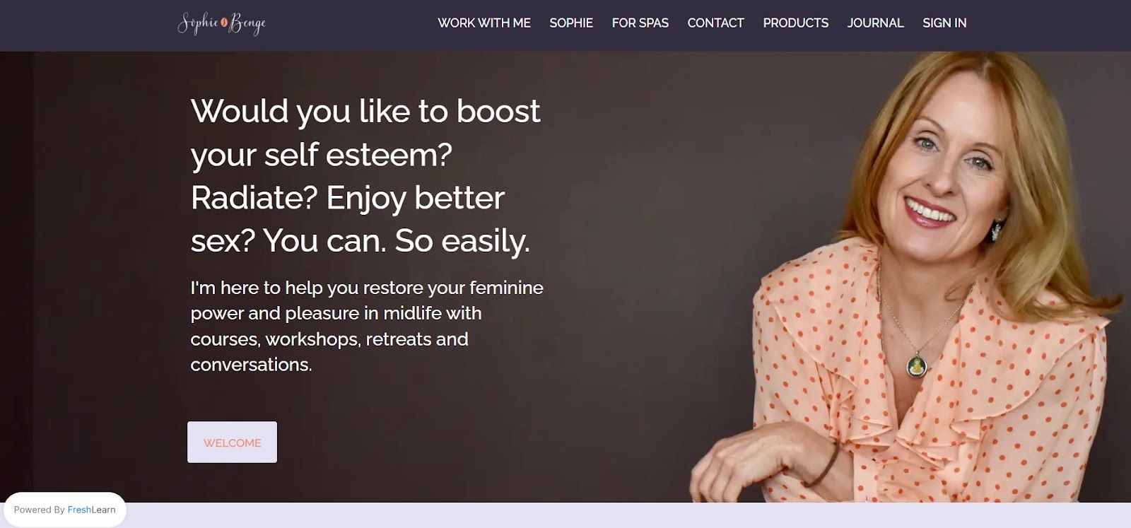
What this page does well: The tone matches the audience. Midlife women exploring this topic aren't looking for corporate language or aggressive sales copy — and Sophie's page doesn't use any. The warmth and personal voice of the copy builds the trust this audience needs before making a purchase decision. Voice consistency between your social presence and your landing page is underrated as a conversion factor.
3. Omega Boxin
Omega Boxing is an inclusive boxing community focused on character development and discipline alongside technical training. They teach a specialized style called "Peek-A-Boo" boxing.
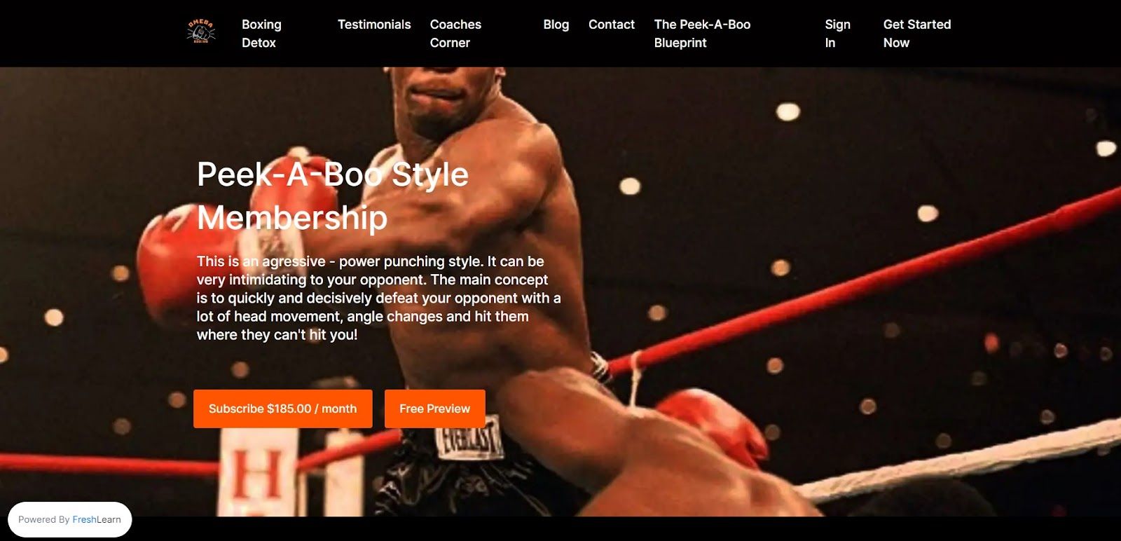
What this page does well: The curriculum section is specific. Most fitness course landing pages describe outcomes vaguely ("get fit," "build discipline"). Omega Boxing names the specific technique they teach and explains what makes their approach distinct. Specificity about method — not just outcome — is a strong conversion signal for buyers who've tried generic programs before and found them lacking.
4. Project Parker
Project Parker offers expert consulting services to businesses across banking, FinTech, iGaming, and retail — from project recovery and platform migrations to cyber security and large-scale transformation programs.
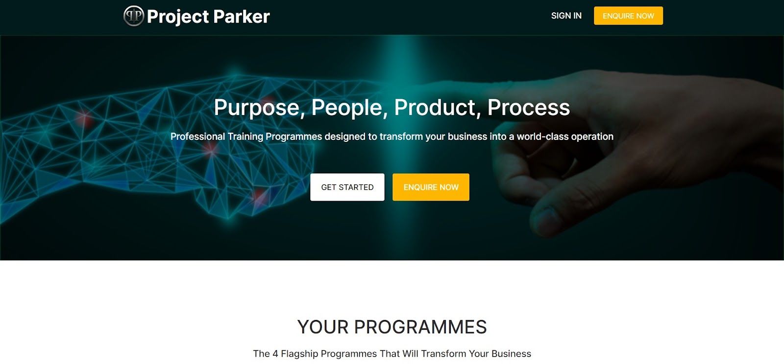
What this page does well: The credibility section leads with specific industries and outcomes rather than generic consulting language. "We've worked with clients across London, Manchester, and Newcastle on platform migrations and M&A" is far more persuasive than "experienced team of consultants." For B2B-adjacent courses and consulting programs, specificity about who you've helped and what you've delivered is the primary conversion driver.
5. Smart Safe Yoga
Dr. Matthew J. Taylor (PT, Ph.D., C-IAYT) bridges yoga practice and medical rehabilitation — creating resources for yoga teachers, students, therapists, and medical professionals.
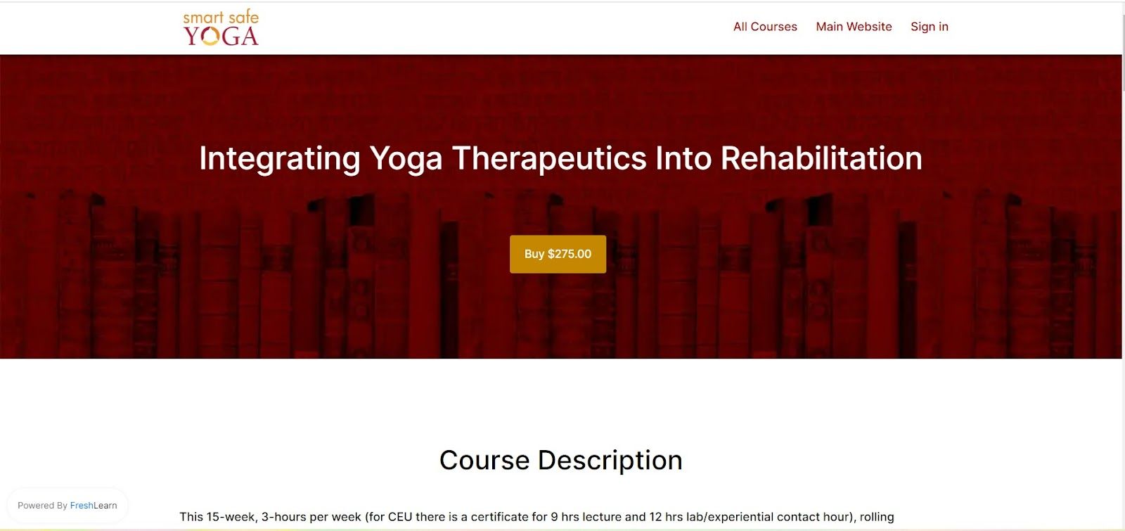
What this page does well: The instructor bio leads with credentials that matter to the specific audience. "PT, Ph.D., C-IAYT" speaks directly to medical and therapy professionals evaluating whether this educator has the rigor their context requires. For courses targeting professional audiences — where credentials signal trustworthiness — leading with the right qualifications is a genuine conversion lever, not a vanity play.
Building Your Course Landing Page on FreshLearn
FreshLearn's sales page builder includes everything described in this guide natively — no external landing page tool required:
- Drag-and-drop block editor with conversion-optimized templates for courses, workshops, memberships, and digital downloads
- Expandable curriculum blocks with video preview and free lesson access
- Testimonial blocks, instructor bio sections, FAQ accordions, and pricing tables
- Countdown timers, scarcity badges, and exit-intent popups for genuine urgency
- Mobile-responsive preview mode before publishing
- Built-in analytics: visitor counts, conversion rates, scroll depth heatmaps, and revenue attribution per page
If you're already hosting your courses on FreshLearn, your sales page connects directly to your course checkout — no redirect, no integration, no friction between the landing page and enrollment.
Build your course landing page on FreshLearn →
FAQ
1. How long should a course landing page be?
Long enough to answer every question a serious buyer would have — no longer. For a $47 mini-course, a tighter page (600–800 words) is fine. For a $997 flagship course, a longer page (1,500–2,500 words) is appropriate because the purchase decision is higher stakes and requires more reassurance. Don't pad either one.
2. Should I have a navigation menu on my course landing page?
No. Navigation menus give visitors an exit route before they've made a decision. A course landing page should have one path: read the page, click the CTA. Remove the nav for landing pages you're driving paid traffic to. It can stay for organic SEO landing pages where discovery is the goal.
3. What's the most important section on a course landing page?
The headline and the testimonials. The headline determines whether visitors stay to read more. The testimonials are the highest-converting element for visitors who are already considering enrolling. If you had to invest disproportionate effort anywhere, invest it in those two sections.
4. How do I know if my landing page is working?
Track your conversion rate (enrollments divided by unique visitors) and your scroll depth. A low conversion rate with good scroll depth means your copy or pricing isn't convincing. A low scroll depth means visitors are dropping off before they even reach the pitch — usually a headline or hero section problem. FreshLearn's sales page analytics show both metrics natively.
5. Can I use AI to write my course landing page copy?
Yes, as a starting point. AI tools are useful for generating headline options, FAQ answers, and benefit bullet points quickly. The output needs editing — especially the headline and the student testimonial prompts — to sound like you rather than a template. FreshLearn's AI Studio generates page copy from your actual course content, which produces more accurate and specific copy than generic AI writing tools.
You might also like:
Hosted by