
The Ultimate Guide to Creating a Course Landing Page That Converts (+ Examples)

As a freelancer, selling my services has always been about more than what I do.
It’s about how I present it.
I’ve learned the hard way that the smallest details in a pitch can change everything. A sentence like “I’ve helped clients grow” barely gets attention. But “I’ve helped clients grow traffic by 120% in 3 months” makes people stop and listen.
Your course sales page works the same way. The way you package your offer, highlight proof, and guide readers determines whether they scroll past or hit “enroll.” In this guide, I’ll show you exactly how to structure a sales page that not only looks good but actually converts.
The Anatomy of a Winning Course Landing Page
A high-converting sales page is about guiding your reader step by step toward a confident “yes”. Every element has a job to do, from the headline at the top to the FAQs at the bottom.
Let’s break it down piece by piece.
The hero section
The hero section is your front door. Don’t focus on selling the entire course yet. Its job is to stop your visitor from clicking away. In just a few seconds, it needs to answer three silent questions running through your reader’s head:
- Is this for me?
- What will I get out of it?
- Do I trust this enough to keep reading?
A strong hero section signals clarity, relevance, and professionalism. Think of it as the hook that earns you the right to explain more.
So what does that look like in practice?
- Start with an outcome-driven headline: Don’t waste words on “Online course on…” Nobody cares about the format yet; they care about the result. A headline like “Master landscape photography: Capture breathtaking photos in 3 weeks” tells me what I’ll achieve and how quickly.
- Use the subtitle to clarify and qualify. This is where you add just enough detail to help readers self-select. For example: “For podcast beginners who want to launch with confidence.” The right subtitle filters out the wrong audience and doubles down on relevance for the right one.
- Lean on visuals that build trust. A photo of you as the instructor (ideally, professional but approachable) is more powerful than stock imagery. If you can, add a short video intro. It humanizes your course and keeps visitors on the page longer.
- Make the CTA impossible to miss. Place one button above the fold without needing a scroll. Keep the wording action-driven (“Enroll now,” “Start writing today”). Secondary CTAs (like “Watch trailer” or “Get a free lesson”) can work well for hesitant readers, but don’t overdo it.
- Design for clarity, not decoration. The headline, visual, and CTA should work together without fighting for attention. If you’re unsure, take a look at your hero section: do you still see the core promise and a clear button to click? If not, strip it back.
Let’s look at course pages that do this well
1. Reedsylearning
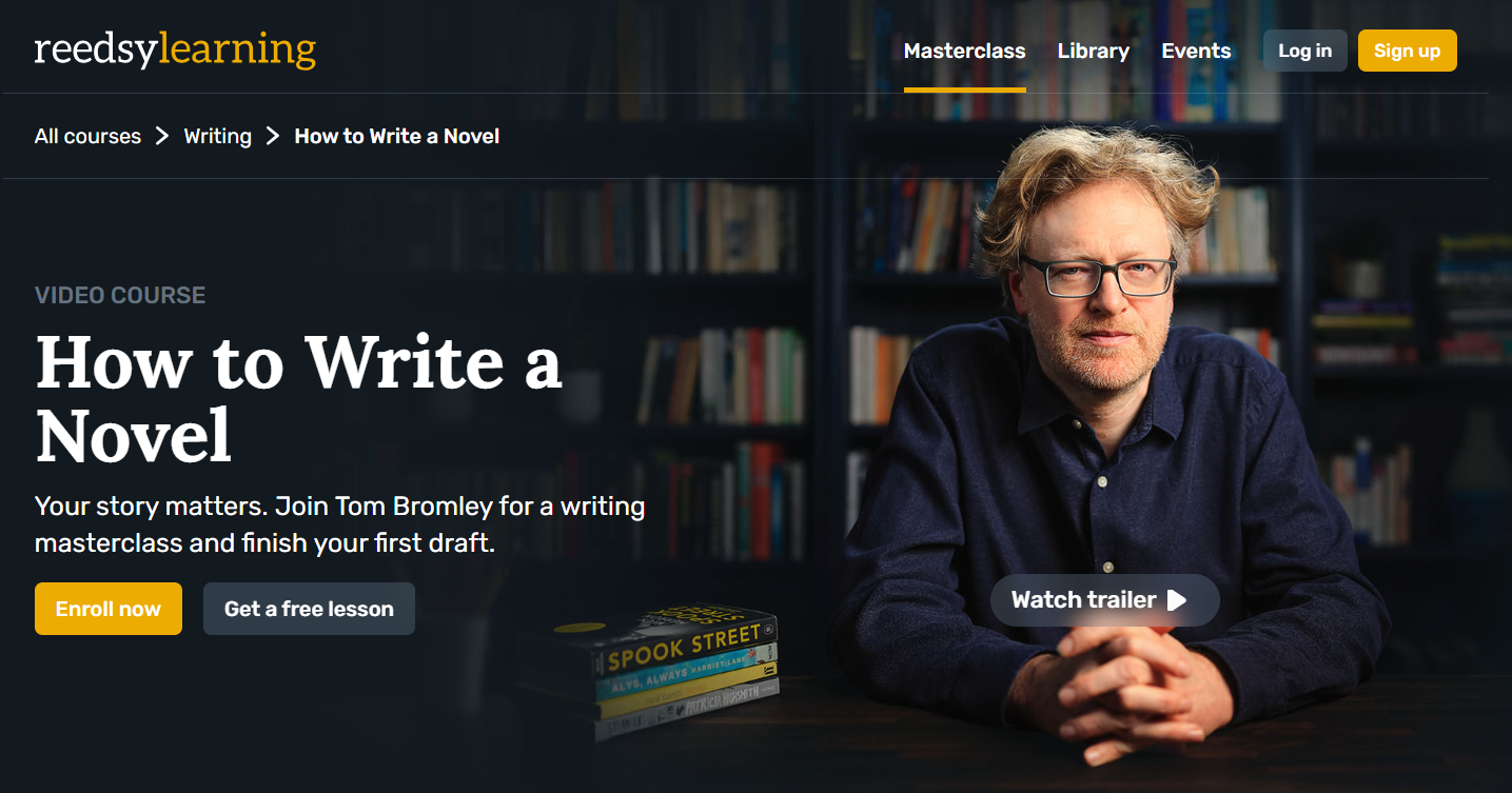
Here, the headline is simple and clear without any jargon, just “How to Write a Novel.” The sub-headline instantly validates the reader’s reason for being there: “Your story matters. Join Tom Bromley for a writing masterclass and finish your first draft.”
It speaks to the exact outcome (finishing a draft) that every aspiring novelist wants. The hero image, a professional shot of the instructor, builds trust right away. While the dual CTA (“Enroll now” vs. “Get a free lesson”) gives both ready buyers and cautious browsers an option.
2. Demand Curve’s Unignorable
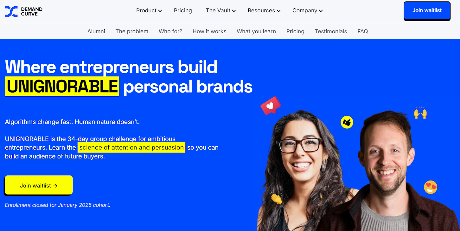
The course page by Demand Curve grabs attention with a bold, distinctive headline: “Where entrepreneurs build UNIGNORABLE personal brands.” The highlighted typography and sharp color contrast make it hard to skim past.
The sub-headline builds intrigue by promising mastery of the “science of attention and persuasion”, a strong outcome that appeals directly to ambitious founders.
Even the waitlist CTA is strategically worded to create urgency without pressure.
The problem and solution
After you’ve won attention with your hero section, you need to prove you understand your reader’s world. People don’t buy courses because they sound interesting. They buy because they believe you “get” their struggles and can guide them to a better place.
If you skip this part and jump straight to “Here’s my course,” you risk sounding transactional. The best course landing pages lean into empathy first, transformation second.
How to present the problem and solution effectively
- Research your audience’s exact words: Listen to the pain points, don’t guess. Take phrases directly from student surveys, community posts, or support questions. Use them verbatim on your page. Example: instead of writing “struggling with productivity,” use what people actually say: “I feel like things just fall through the cracks.”
- Stack problems, don’t generalize: List 3–5 distinct challenges they face, each specific enough to make the reader nod along. (“I waste so much time organizing files,” “I don’t know where to start when I sit down to work,” “I feel overwhelmed by all the information I consume.”)
- Show the cost of staying stuck: Point out what inaction costs them. Is it lost time, missed promotions, stalled projects, or lower confidence? The more tangible, the better.
- Introduce the solution as a turning point: Once the pain is clear, bring in your course not as a product but as the “way out.” Frame it as the tool that brings clarity, or promises to change their frustration into momentum.
- Use aspirational but grounded language: Avoid vague promises like “transform your life.” Instead, paint vivid scenarios: “Imagine having all your notes organized in one place so you can find exactly what you need in seconds.”
Let’s look at course pages that do this well
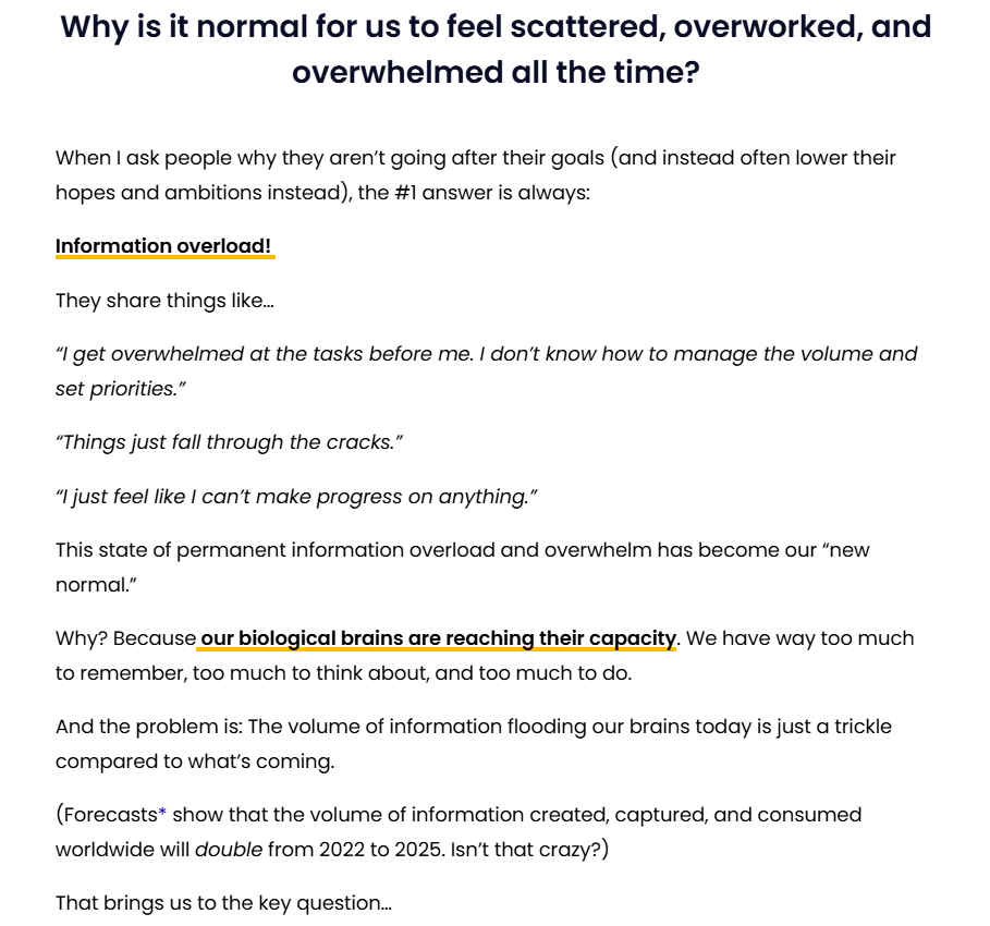
1. BASB Foundation (Building a Second Brain)
The BASB course page nails the problem-solution arc. The problem is introduced as “information overload” (a universal frustration) and reinforced with real quotes that sound like something an overwhelmed professional would actually say. Then, the stakes are raised with data.
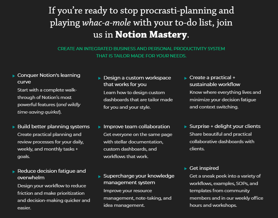
Then comes the solution: a “Second Brain.” The shift is a trusted external place for ideas and knowledge. The course page transitions from problem to solution through specific benefits:
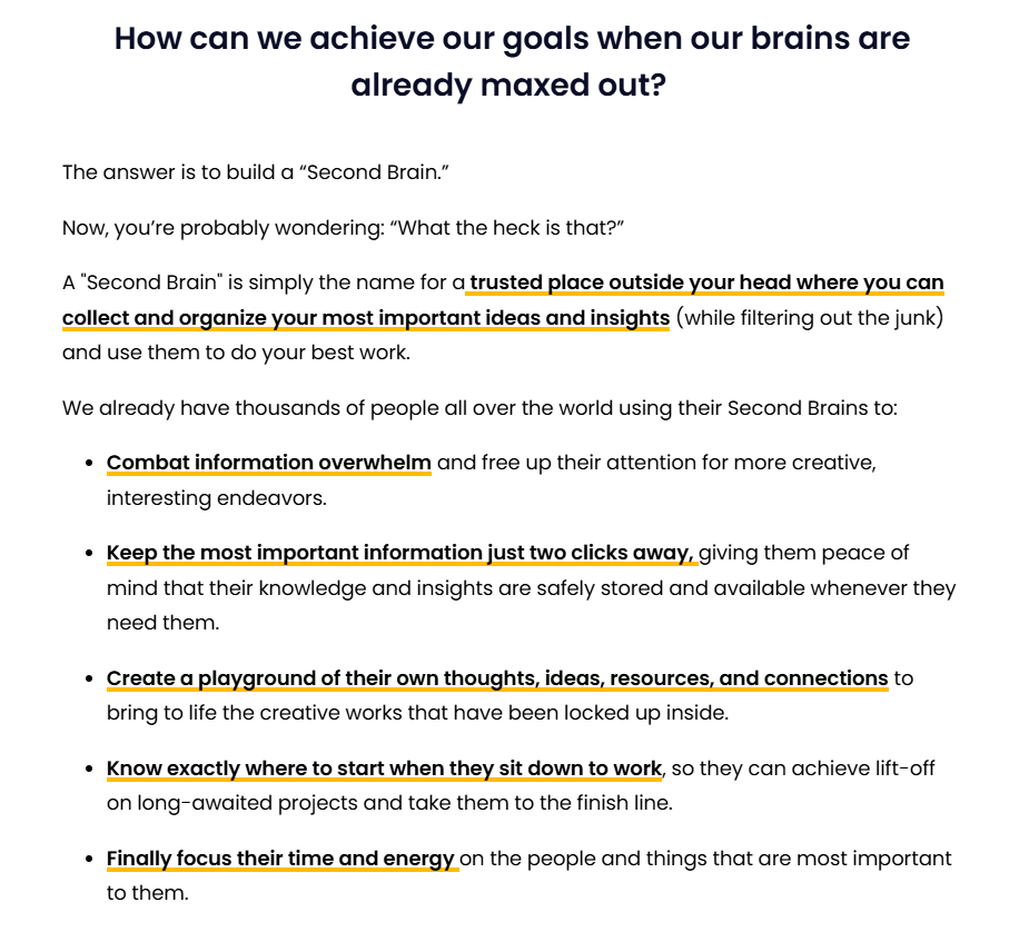
The offer section shows deliverables like modules, templates, and playbooks. But see how each feature is tied to an outcome. It’s not just “6 modules.” It’s “6 modules with succinct instructional videos,” so you absorb the fundamentals without wasting time.

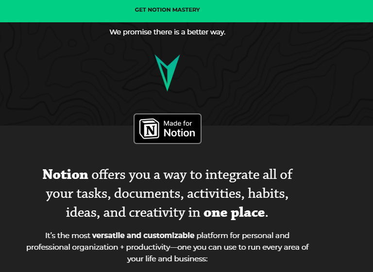
2. Notion Mastery
The Notion course page takes the same formula and applies it to productivity issues. You’ll see the pain points laid out in blunt, relatable language. The copy stacks them up to make readers nod along: “Yes, that’s me.”
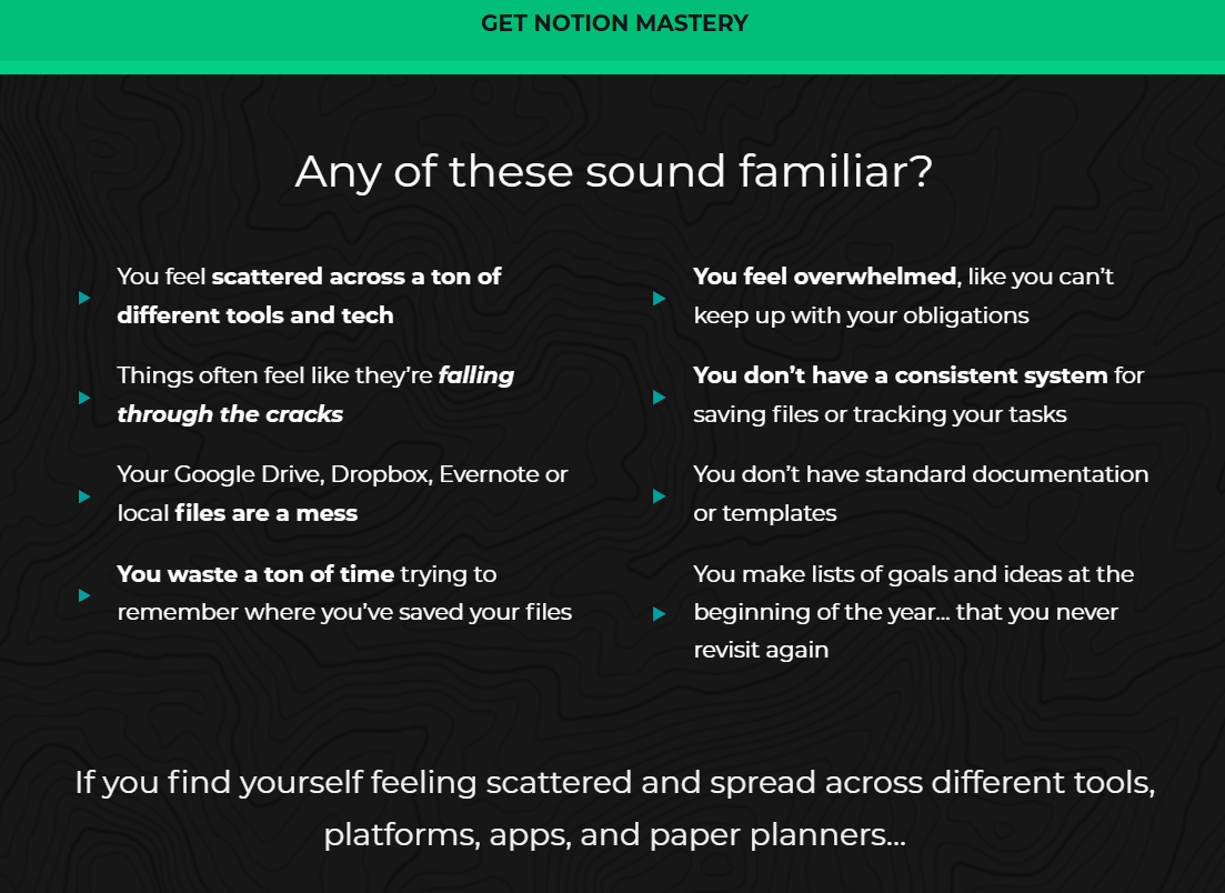
Then, there’s the solution — a single customizable system where all your tasks, documents, and ideas all come together.
The page closes the loop by contrasting the “before” (messy, scattered, overwhelmed) with the “after” (organized, focused, inspired).

Building trust and authority
At this point, your reader is leaning in. They’re thinking: “Okay, this sounds like it could help me… but why should I believe you?” And now you need to prove you’re worth listening to.
There are two pillars to making this section work:
- The instructor bio: who’s behind the course and why they’re credible.
- Social proof: testimonials from others that your course delivers what you promise.
Both matter. You might have the most engaging personality in your niche, but without proof from past students, your claims will look untested. Also, you could stack testimonials all day, but if readers don’t know who’s teaching them, they’ll hesitate.
Crafting a bio that builds confidence
A good bio is short, personal, and focused on results. You don’t need to list your entire career history, just the highlights that position you as a trusted guide.
Actionable ways to nail your bio:
- Lead with authority, not chronology: Open with your strongest credential, recognition, or achievement. Example: “Katie has helped 500+ small business owners grow communities that stick around.”
- Keep it tight: Two short paragraphs max. Visitors want reassurance, not a résumé.
- Show passion: Mention why you created this course and why you care about teaching it. Enthusiasm is credibility, too.
- Pair with a photo: A professional headshot or casual but polished lifestyle photo adds instant trust. The point is to look approachable and credible.
Take a look at Katie Creative Company’s course page:
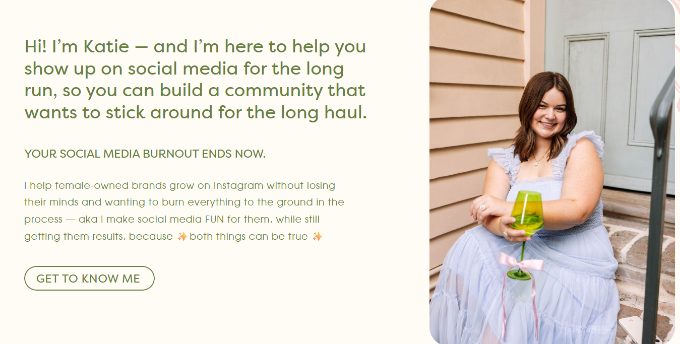
Katie introduces herself with warmth. She mixes credibility (helping female-owned brands grow) with relatability (she frames herself as someone who makes social media fun instead of stressful).
Her picture also reinforces that she’s approachable and authentic. It’s not a stiff, corporate headshot, which matches her audience.
Layering in social proof
The fastest way to earn trust is by showing others who’ve had success with your course. Testimonials work best when they tell a mini story: where the student started, what they learned, and the results they achieved.
Here are some tips for powerful testimonials:
- Use results as the headline: Highlight the transformation upfront. For example, “The conversion of my landing pages improved by 100%.” It grabs your readers’ attention immediately.
- Include names, titles, and photos: Anonymous quotes don’t build trust. Real faces and roles do.
- Make them scannable: Long testimonials are fine, but bold the key phrases or break them up for easy reading.
- Diversify formats: Mix short, punchy quotes with longer case studies or even video snippets if you have them.
Look at this example from GetUplift:
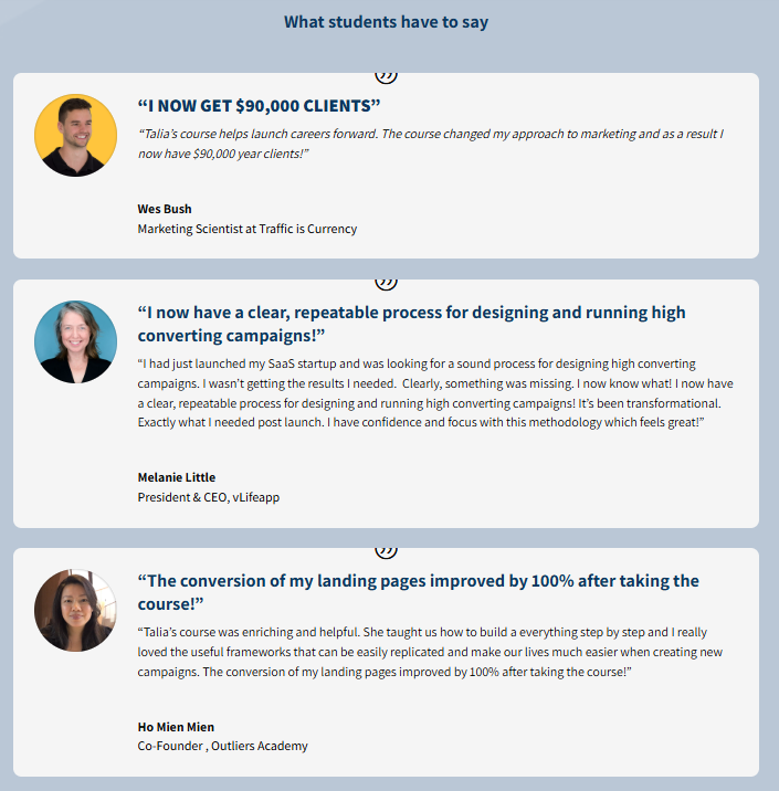
See how the testimonials are structured with a bold results-focused headline (“I NOW GET $90,000 CLIENTS”). It shows immediate proof with context, and the professional photos prevent it from feeling fabricated — so, it works.
The Instagram Lab uses a more emotional angle:
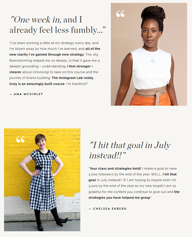
Quotes like “One week in, and I already feel less fumbly” are paired with stylish portraits. The testimonials showcase the confidence, clarity, and motivation students feel. This approach connects especially well when the transformation is as much emotional as it is measurable.
Finally, there’s broader media credibility:
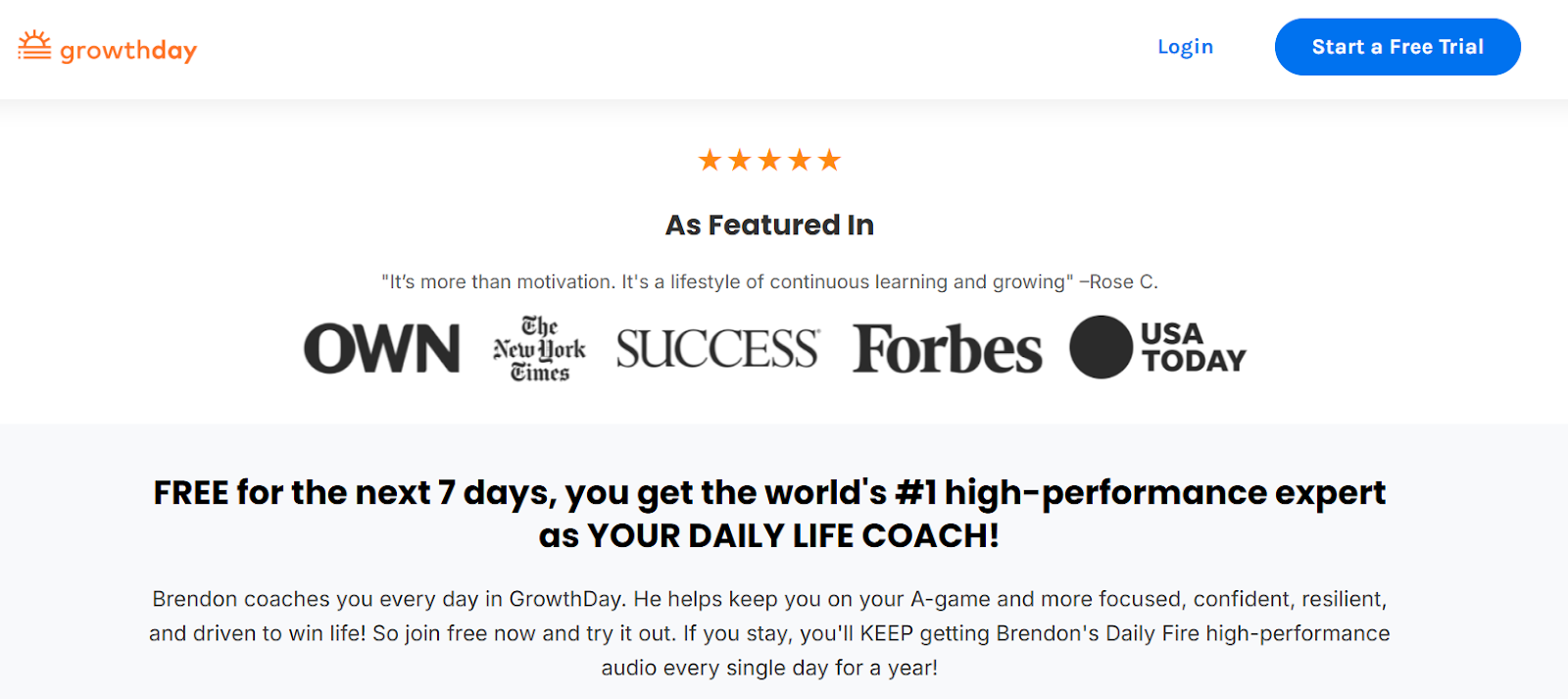
Brendon Burchard’s GrowthDay leverages logos from Forbes, USA Today, OWN, and The New York Times alongside a high star rating.
For creators with press mentions or partnerships, a simple “As featured in” row of logos adds instant authority, especially if your name is not yet widely recognized.
Deconstructing the course
By this point, your reader is intrigued and starting to believe your course could be the solution. But curiosity alone won’t get them to buy. They need to see what’s inside.
A clear curriculum outline reassures prospects that your course is structured, well thought out, and capable of taking them from start to finish without confusion.
Here’s how to make your course outline irresistible.
- Break it down by modules or weeks: People want to see a progression, not a wall of content. “Week 1: Own your core message” feels more actionable than “6-hour lecture on storytelling.”
- Highlight outcomes, not just topics: Don’t just list “SEO Fundamentals.” Say: “Learn SEO basics so your content starts ranking on Google in weeks, not months.” Each module should answer: what will this help the learner achieve?
- Add a sneak peek: Screenshots, mockups of the course inside a laptop/tablet, or even a quick video trailer give a tangible feel of the product. People trust what they can see.
- Consider offering a free lesson: A taste of the material builds confidence and lowers friction for hesitant buyers.
- Keep it digestible. If your outline looks overwhelming, people may doubt they’ll finish it. Show progression and momentum rather than an endless syllabus.
Take this example from Gabrielle Bernstein’s Bestseller Masterclass.
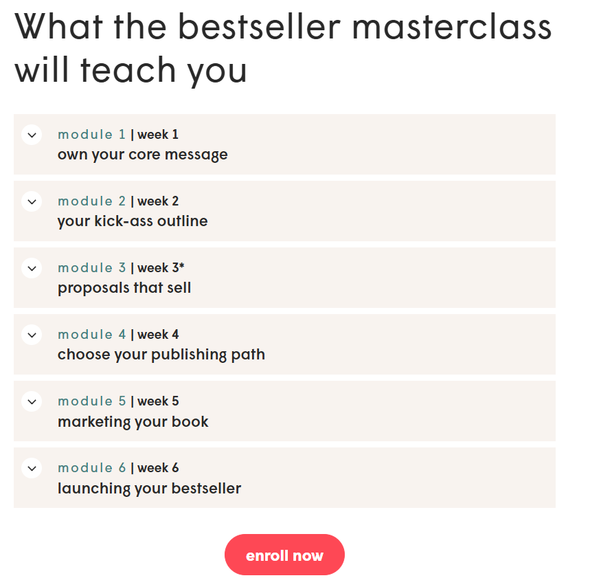
It’s broken into a week-by-week structure, with each module labeled clearly (“Week 2: Your kick-ass outline,” “Week 5: Marketing your book”). The value here is in progression.
The flow reassures learners they won’t be dropped in the deep end; instead, they’re walked step-by-step through the entire journey.
The “Enroll now” button, right below the outline, smartly captures readers while the content is fresh in their minds.
Here’s another from Marie Forleo’s Copy Cure
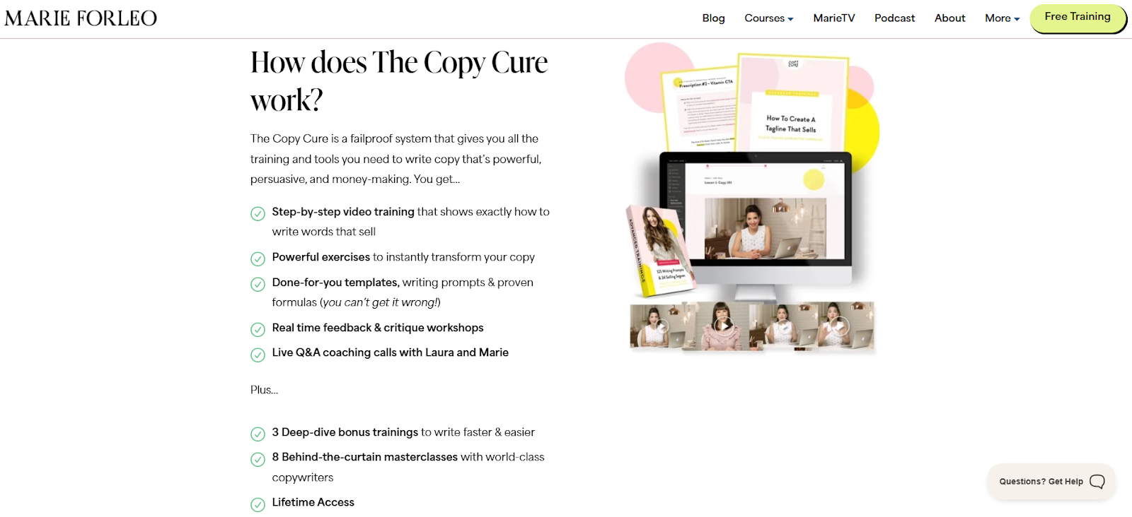
Copy Cure goes further by not just listing modules but tying them directly to benefits. Instead of a bland “Module 1: Video training,” it says: “Step-by-step video training that shows exactly how to write words that sell.”
They also emphasize interactive features (live Q&A, critique workshops, done-for-you templates), which add perceived value beyond static lessons.
Notice the mockups: a computer screen, worksheets, and video thumbnails. These visuals make the course feel like a real, premium product you’re getting access to, not just an abstract promise.

The offer and the close
This is where everything you’ve laid out so far (your hero, the problem, the solution, the trust) comes together. Your visitor now knows what your course is and why it matters.
The last step is to make the decision easy by stacking value, showing clear pricing, and asking for the sale directly.
How to nail the offer and close
- Stack the value before the price: List everything that’s included (modules, templates, live sessions, bonus materials) along with their individual worth if possible. When people see the total value first, the actual price feels like a bargain.
- Present pricing options cleanly: Whether it’s one-time or installment, keep your pricing tables simple, easy to scan, and free of clutter. Call out the “best value” option with a label or highlight to nudge readers in the right direction.
- Use money-back guarantees: A bold refund policy shows confidence in your course and reassures buyers that the risk is low. Phrases like “100% money-back guarantee” or “Try it risk-free for 30 days” create a safety net that encourages faster decisions.
- Place multiple CTA buttons: Don’t make people scroll back up. Add clear CTAs after the curriculum, testimonials, offer breakdown, and again at the very end. Keep the wording action-driven: “I’m in,” “Enroll now,” or “Get instant access.”
- Add a P.S. recap for skimmers: Some readers skip straight to the bottom. Summarize the course outcomes and bonuses here, and put one final strong CTA right below.
Marie Forleo nails it again with her Time Genius course’s landing page.
She keeps it clean with two options: monthly or one-time payment. Notice how the “Best Value” plan is highlighted with a subtle tag and positioned on the right — our eyes naturally gravitate there. A money-back guarantee is placed right above, making the choice feel safe before you even consider the price.
Tom Bilyeu’s “Zero to Founder” leans heavily into value stacking.
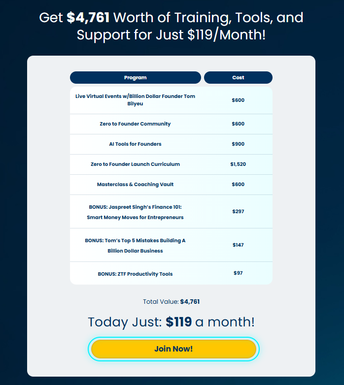
Each deliverable (live events, community, tools, curriculum) is listed with its value, which adds up to $4,761. Then he drops the price to just $119/month. It makes the offer feel like a steal because you’re seeing the discount framed against a much larger perceived value. The yellow “Join Now!” CTA pops clearly against the dark background.
Now, let’s take a look at Gabrielle Bernstein’s Bestseller Masterclass once again.
Gabrielle uses a simple two-option pricing table: monthly payments or one-time. Both have “Enroll now” CTAs right beneath the price, and she pairs this with a 100% money-back guarantee statement just below.
It reduces friction for budget-conscious buyers (monthly) while nudging action with urgency and safety.

The FAQ section
No matter how your sales page is, most of your visitors will still have a few questions before they buy. That’s why you need an FAQ section. It’s your final chance to clear doubts and reassure people they’re making the right decision.
Think of it like sitting across from a potential student and answering their biggest “Yeah, but what if…” questions. Done well, this section reduces friction and shows you’ve thought about every angle.
Here’s how to make it work:
- List the questions they’re actually asking: Focus on the concerns you hear most often: Do I have enough time? Is this beginner-friendly? Can I get a refund? What if I fall behind? You can source these from your previous students.
- Be direct, not evasive: If a question is about cost, don’t dance around it. If it’s about difficulty level, say clearly who the course is and isn’t for. Keep answers concise but thorough.
- Make it easy to scan: Use expandable toggles (like Ultraspeaking does in the example coming up) or bolded questions (like Justin Welsh’s page). The format matters almost as much as the answers.
- Cover logistics too: Course length, start dates, support options, and refund policy are dealbreakers for many students. So spell them out even if you’ve mentioned them earlier.
For example, Ultraspeaking uses a neat accordion layout to break down student concerns.
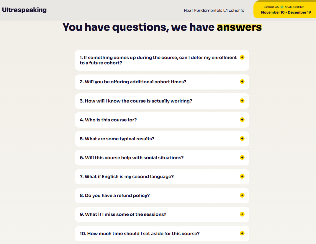
The design is neat, questions expand with a click, which keeps the page uncluttered.
Justin Welsh’s Content OS, a course on social media and marketing, goes a step further. Instead of generic Q&A, he weaves in credibility by clarifying what the course is not (“Is this a copywriting course?” “Who should NOT buy this course?”).
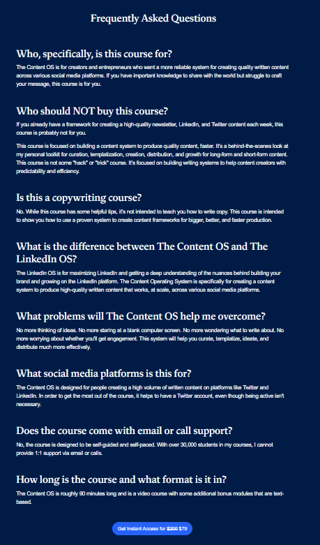
This is smart because it filters out mismatched buyers and reinforces authority at the same time.
If you take Codecademy’s Learn JavaScript course, their FAQs are paired with “related resources” and courses.
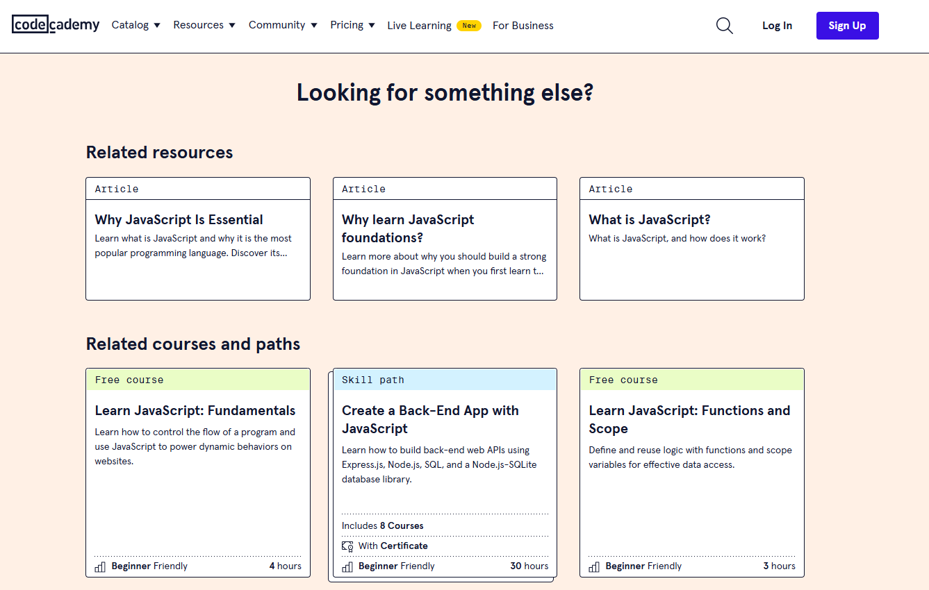
This helps learners who aren’t ready for a purchase still engage with their ecosystem, a smart way to keep people in the funnel.
Bringing it all together
If you’ve made it this far, you’ve now mastered the blueprint of creating a sales page that converts. But this is just half the battle. The other half is execution.
But you don’t need to figure out the moving parts on your own. FreshLearn was designed with course creators like you in mind. You can spin up a page that looks polished from day one, track how visitors interact with it, and tweak headlines, CTAs, and pricing with built-in analytics.
Want to offer bonuses or limited-time discounts? FreshLearn lets you do it with a couple of clicks. Need to deliver upsells or bundles right after checkout? That’s built in too, so you can increase revenue without reinventing the wheel.
So, here’s your next step: take what you’ve just learned and put it into action. Create a FreshLearn account for free, set up your course landing page, and start delivering.
Course Landing Page FAQs
1. How is the course landing page helpful to students?
A well-structured course landing page helps students decide if the course is right for them. It gives them a clear picture of what they’ll learn, what problems the course solves, and what outcomes to expect.
2. How to sell a course online through a landing page?
You sell by guiding visitors step by step: start with a strong hook, show you understand their struggles, present your course as the solution, back it up with proof, then make enrolling simple. A clear layout and compelling CTAs can convert your readers’ interest into actual sales.
3. What is the most important part of a landing page?
The opening hero section. If the headline and visuals don’t grab attention and show relevance, visitors won’t scroll further. It’s your first chance to make them stay. The rest of the page (testimonials, curriculum, pricing) only matters if the hero earns that first click.
4. Do I need a long or short landing page for my course?
It depends on your offer. Expensive or detailed courses need longer pages that explain outcomes thoroughly. For simple, lower-cost offers, a short page with a crisp outcome and clear CTA often works best. The key is to provide enough detail for the price point.
5. How many CTAs should a course landing page have?
At least three. Place one right at the top, one in the middle after key proof like testimonials or curriculum, and one at the very end. This way, no matter how far someone scrolls, they’ll always have a clear next step without searching.
6. What mistakes should I avoid on a course landing page?
Don’t overwhelm with clutter, hide your pricing, or use vague copy. Avoid focusing only on features like “10 hours of video.” Instead, tie each element to real outcomes of what students gain. And never use generic CTAs like “Submit.” Move with clarity and relevance.
You might also like
Hosted by
