How to create a landing page for courses (to sell more)
Your course landing page should be your sales machine. Learn the strategies & tactics for building a high-converting course landing page with real-world examples. The right landing page can print money for you
How to create a landing page for courses?
Are you a creator looking to offer online courses?
Among the first things that you need to consider is how you will create your course landing page.
After all, if nobody lands on your page, no one will see what amazing content and course you have to offer!
That's why all creators need to learn how to create an attention-grabbing landing page for their courses.
In this blog post, we'll discuss everything from the key elements of a successful page to tips for increasing conversion rates once visitors land on your site.
What is a course landing page?
A course landing page is a web page designed to give visitors a snapshot of your courses.
Its aim is to outline the benefits of the course and motivate people to enroll.
A well-crafted course landing page should give visitors a good overview of what they will learn
Typically, a good landing page includes a :
- A brief overview of what’s included in the course
- The cost, how many hours or weeks the program runs for
- Who it’s suitable for, a condensed version of the curriculum, testimonials and success stories from previous students and,
- Some types of incentives might enhance their experience.
A good course landing page should highlight the benefits that students get in terms of knowledge or expertise when they enrol in your course(s).
Put simply – an effective course landing page can be the difference between someone checking out your product or services versus someone clicking away from it.
Why do you need a landing page for your online course?
The primary function of your course landing page is to serve as a call-to-action button that directs action across the page.
The sales funnel, which directs website visitors from piquing their interest to converting them into paying clients, includes landing pages as one of its key elements.
So, if you want to reach more people and make more sales, you need effective marketing — including a high-converting landing page for your course.
If you're still on the fence, here are just a few more reasons why it could be exactly what you need.
6 key elements of a landing page
1. Offers all information about your course
Landing pages can make or break your chances of finding success with your course.
A good landing page should be informative without being overwhelming.
It should concisely explain what the course is about, its value, and how it can benefit students.
Information like cost, duration, and any necessary tools or resources needed for the course should also be provided.
A great landing page will answer any questions potential customers may have before they click away from the site.
Additionally, providing links to helpful related articles as well as customer reviews is a great way to showcase your course's worth and garner interest while still maintaining an efficient design.
With all this in mind, it's safe to say that if you want your course to succeed, an effective landing page with all the information included is essential.
2. Leaves a good first impression
The first impression counts!
A good landing page is probably the single most important element to succeed online.
So make sure to spend the time creating an impactful landing page that will grab attention!
Creating an effective landing page involves understanding what visitors are looking for, and providing them with the information they need.
This means including clear navigation, clean design, great visuals, and an easy-to-understand message.
The more effort you put into getting the appearance right, the better your chances of convincing visitors to stay on your page.
As well as leaving a good overall impression, this will also help increase conversions and results.
3. Easy to set up
Creating an effective landing page is often one of the most time-consuming parts of any marketing campaign.
Thankfully, if done right, it doesn't have to be time-consuming and difficult.
By following a few easy steps, you can make sure that your landing page is eye-catching and beneficial to potential consumers.
It doesn't matter whether you're just getting started or a seasoned pro; setting up an effective landing page should be easy!
The key lies in using the right tools for the job.
And a shameless plug to Freshlearn - I believe the easiest course landing page builder out there with templates
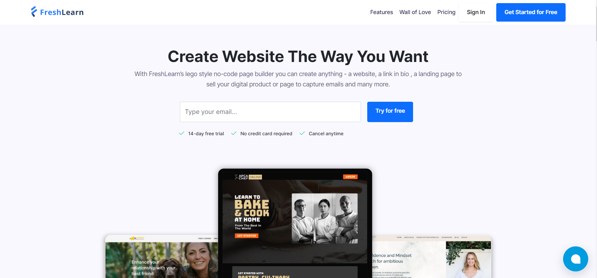
So don't get bogged down in long processes - keep it easy and get your perfect landing page up and running in no time at all!
4. Easy to convert
An effective landing page should be able to show you a great return on your marketing investments.
It doesn't have to be overly complex, but it should be carefully crafted, providing the right information and making it simple for visitors to take the desired action when they land on it.
Make sure your landing page is designed well enough to encourage clicks for conversions.
It's worth the effort to make sure your message is clear and all navigation cues point in the direction of conversion. When done correctly, you'll be reaching your goals in no time!
5. Boost SEO
Landing pages also serve as the building blocks of SEO optimization.
It draws in visitors and offers them valuable information, which helps increase the website's ranking on search engine result pages.
A good landing page will have relevant keywords and easy-to-understand navigation, as well as short, useful content that answers customer questions.
It must also be optimized for mobile devices so that customers can access the page even when they’re away from their desktop or laptop computer.
By ensuring your landing page has these components, you’ll provide an enjoyable user experience that drives traffic to your website – which is a key element when it comes to boosting SEO.
6. Collect customer information
Having a landing page on your website is essential if you want to collect valuable customer information.
Not only do they allow businesses to gain interest, but they also measure it by capturing customer details.
With effective landing pages, it is much easier to target, engage, measure, and track leads.
By understanding how many visitors take action with an offer or form fill - businesses can truly craft a custom experience for each visitor!
An effective landing page saves time and boosts traffic conversion rates; allowing you to dive into customer behaviour in depth so you can tailor your communication accordingly.
Essential ingredients in online course landing pages
If you’re ready to take your online course to the next level by creating an effective landing page, you’re in luck!
Because I have some great tips for designing a killer landing page—and they don’t require coding skills!
1. Determine who your course is meant for
When crafting an effective landing page, the most important thing to consider is who exactly you're creating it for.
Evaluate what knowledge and skills potential students have, pinpoint their problems and wants, anticipate any common questions or hesitations that they might have, and adjust your offer accordingly.
You should also consider using language and design elements that match and appeal to your target audience.
One of the main advantages of creating a targeted landing page is that visitors will be able to easily identify if the course is for them, leading to higher conversions.
A well-designed landing page is essential for those looking to drive more leads into their online courses.
2. Use short but appealing headlines
Writing effective headlines for your landing page is essential to drawing the attention you desire.
They should be concise, engaging, and all about the visitor; always keep the customer in mind when crafting a headline.
Ask yourself what will grab the audience's eye and compel them to keep reading.
Varying font styles and sizes can also help create more attractive and appealing headings.
Choosing short yet appealing headlines can be tricky – but it's worth spending the time here to get it right!
Short headlines are easier to read and understand and often draw in more users than longer ones, so think about using keywords that really stand out and entice people to click through to read more.
Additionally, try using language that matches and aligns with your brand voice for a consistent message throughout the page.
3. Use strong action words
Creating a landing page that truly grabs attention and drives sales requires the right words.
To make sure potential customers don’t scroll past, use strong action words that capture interest and generate a sense of urgency.
When crafting your message, use verbs and adjectives that evoke emotion and help clearly explain how customers will benefit from what you have to offer.
For example, rather than “sign up”, use “start your journey here”; instead of “get more information”, encourage readers to “learn more secrets”.
Experiment with different phrases and find out what works best for you!
4. Use engaging media
To really make an impact on your landing pages, using engaging media is key.
Utilizing attractive media, such as movies, audio clips, and interactive graphics is crucial for making sure your landing page is as captivating as possible.
Videos are a fantastic tool that can be applied to enticingly present your services.
Audio clips allow visitors to connect with you and get to know more about who your company is and what it stands for.
Interactive images bring engagement into the equation, inviting visitors to take action.
By craftily combining visuals and words you can make it one-of-a-kind and truly stand out from the rest.
Make sure that each piece serves its own purpose once viewers land on your page for the best overall effect!
5. Add testimonials
Including testimonials on your landing page effectively increases conversions and builds trust with potential customers.
Real-life examples help you stand out from competitors and create a lasting impression.
Showing visitors that previous customers have had positive experiences with your business lets them know they’ll be in good hands.
By including testimonials, you'll also provide social evidence that can persuade potential customers to buy.
Testimonials give visitor credibility to the message you are trying to promote on your landing page, so be sure to make the most of this powerful tool.
Top 5 landing page examples on Freshlearn you can take inspiration from
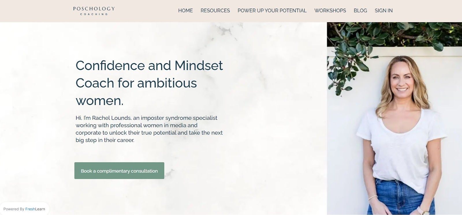
1. Poschology Coaching
Rachel Lounds is an imposter syndrome specialist.
She helps professional women in the media and corporate worlds tackle their self-doubt so they can reach for bigger opportunities.
She has special expertise that lets them access inner confidence, giving these ambitious ladies the spark to launch themselves into success.
2. Sophie Benge
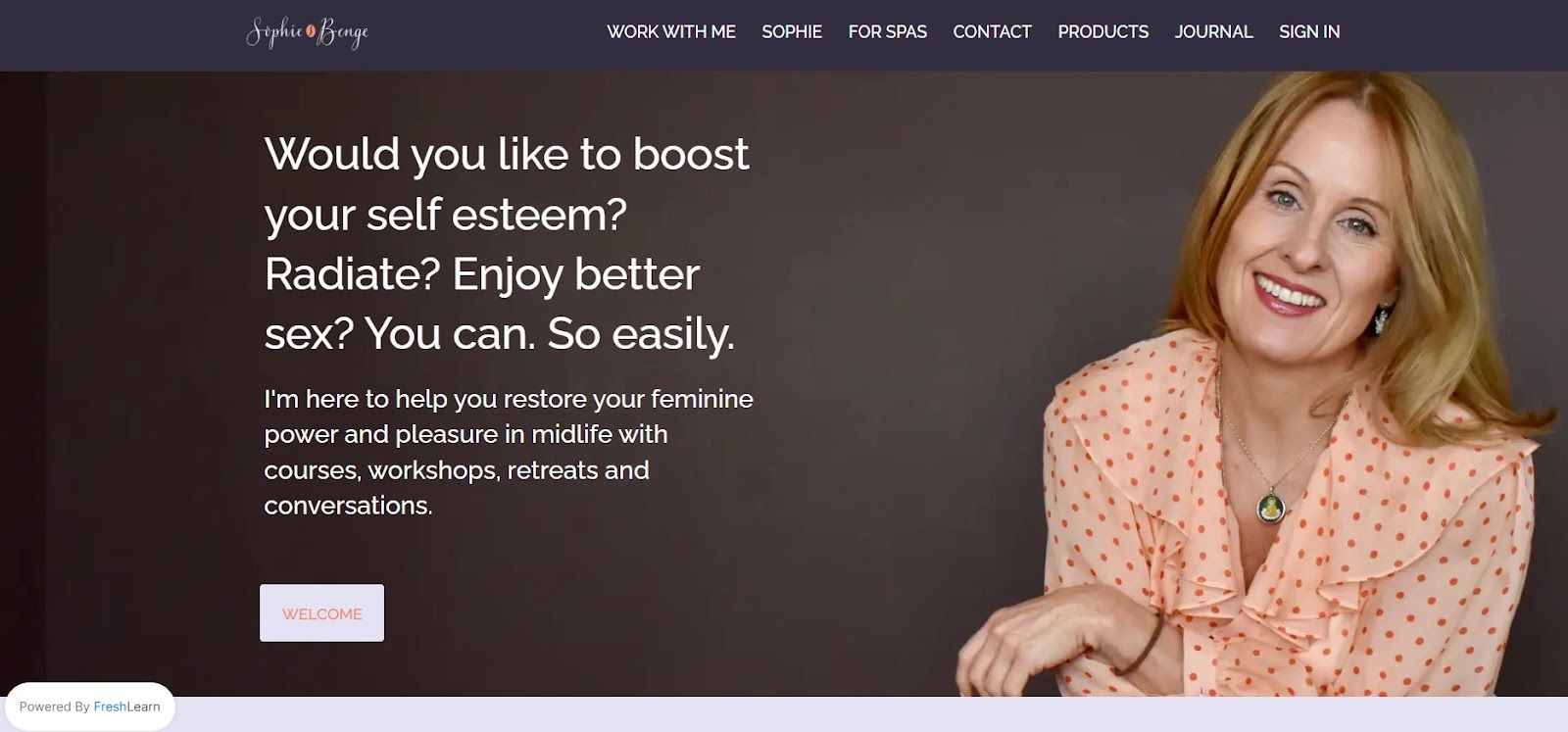
Sophie Benge is an inspiring Freshlearn creator who helps midlife women rediscover their feminine power and pleasure!
Her courses, workshops, retreats, and conversations are designed to empower you with the confidence you need.
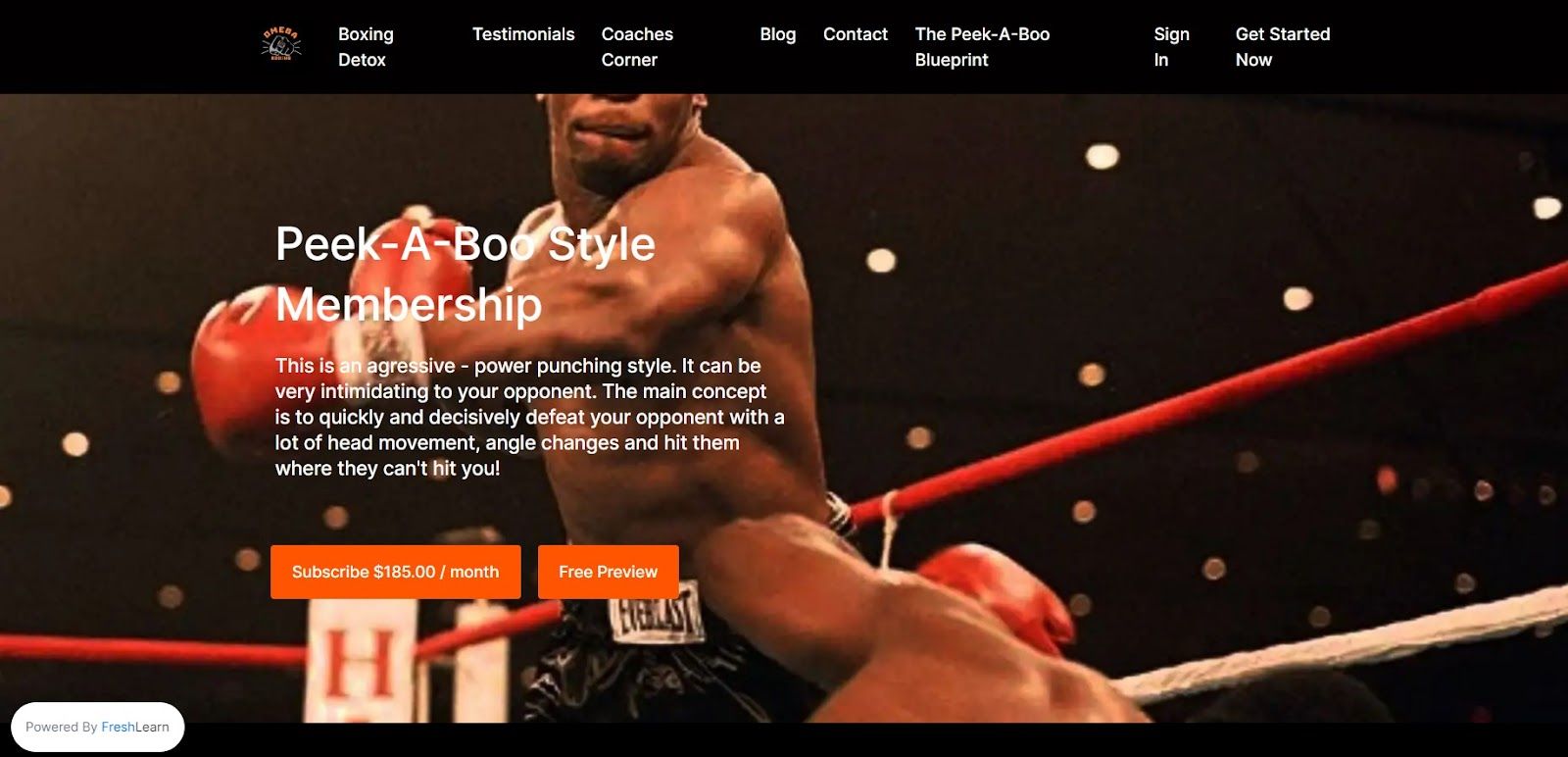
3. Omega Boxin
Omega Boxing is a place to go when you want more than just a physical boxing experience.
It's an inclusive community that believes in cultivating strong character and producing disciplined boxers, young or old!
They foster character development and discipline while cultivating our members' talent into becoming skilled boxers.
Omega boxing teaches a unique style of boxing called - "Peek-A-Boo"
Their specialized training program gives you all the one-on-one help and support needed to perfect your technique, as well as old-school boxing instruction for those looking for a classic touch.
4. Project Parker
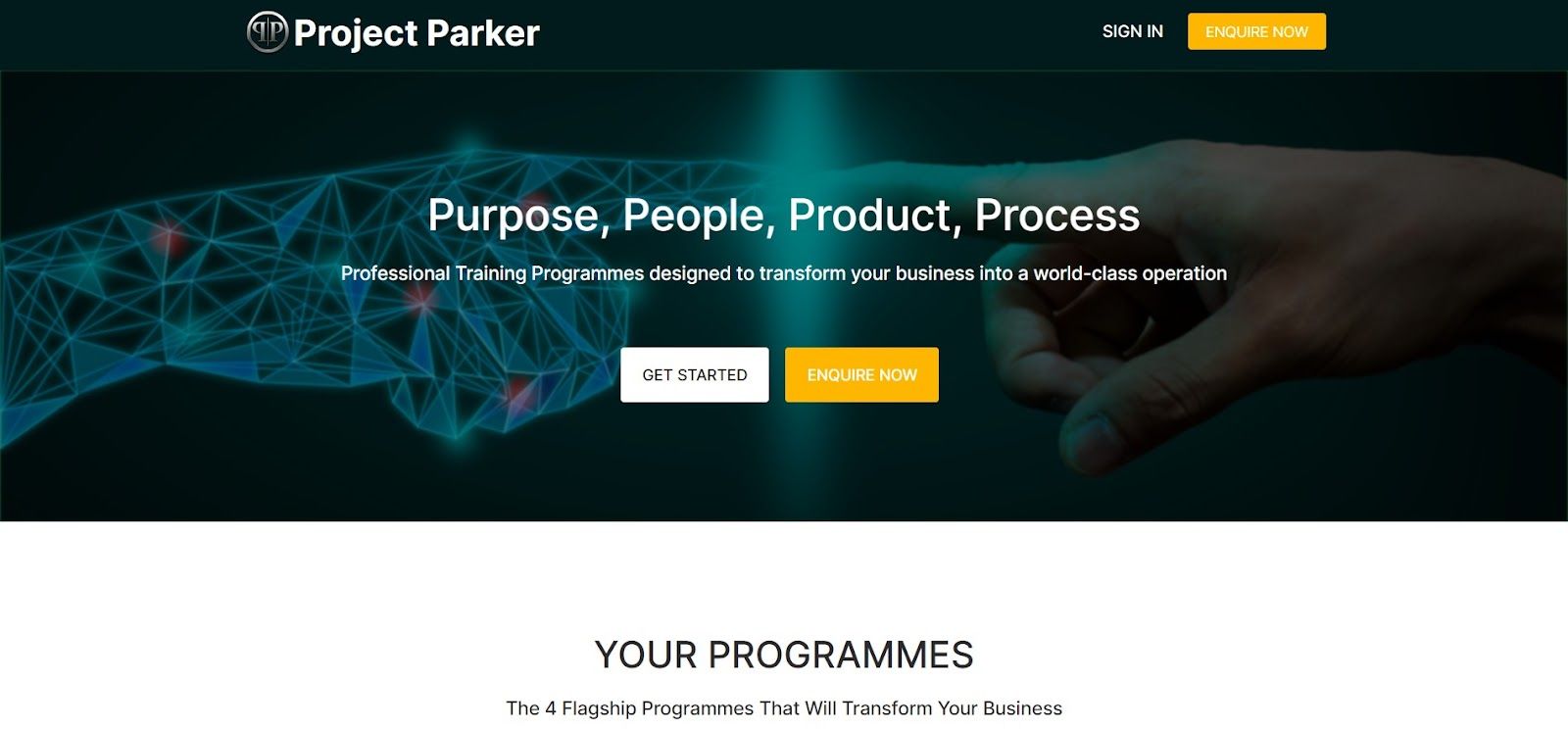
Project Parker offers expert-level advice to businesses in all sorts of industries, from banking and finance to retail.
Their experienced team provides specialized consulting services tailored to corporate clients across an array of industries - from banking and FinTech to iGaming and retail sectors.
Project Parker has the experience to help your firm achieve its objectives, whether you're looking for project recovery, platform migrations, mergers and acquisitions, marketing, cyber security, IT infrastructure, mobile platform, or large-scale transformation programs.
They have collaborated with business clients from major European cities like London, Manchester, and Newcastle.
5. Smart Safe Yoga
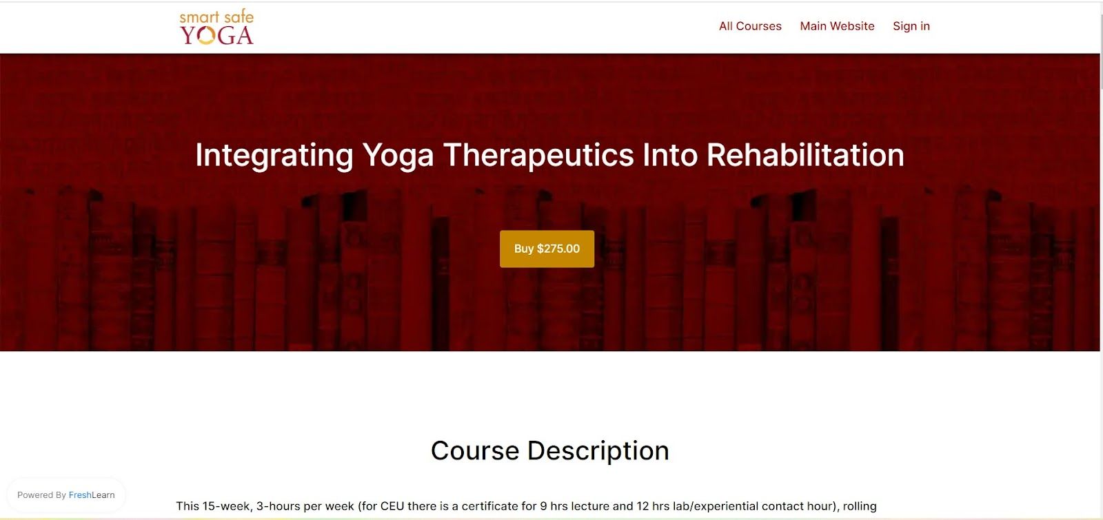
Dr. Matthew J. Taylor, PT, Ph.D., C-IAYT is a true trailblazer in the world of yoga.
He makes efforts to develop motivating and cutting-edge tools for everyone from yoga instructors to medical professionals.
A key component of everyone's practice, Smart Safe Yoga promotes thoughtful exploration that fosters creativity and awareness.
With his Smart Safe Yoga initiative, Dr Taylor is helping the international yoga community to stay creative and mindful by providing resources for teachers, students, therapists, and medical professionals alike.
His helpful programs are paving the way forward in incorporating safe but smart methods of practice that everyone can benefit from!
Make your next big move with FreshLearn!!
Congratulations! Now that you have all the materials, you can design a landing page that will entice users to enrol in your online course.
Follow these tips and you can be sure that your page will sell more courses.
Over 11,475 creators have made more than $20 million by launching and selling their own products directly to their audience.
Don't take our word for it - experience it yourself


